
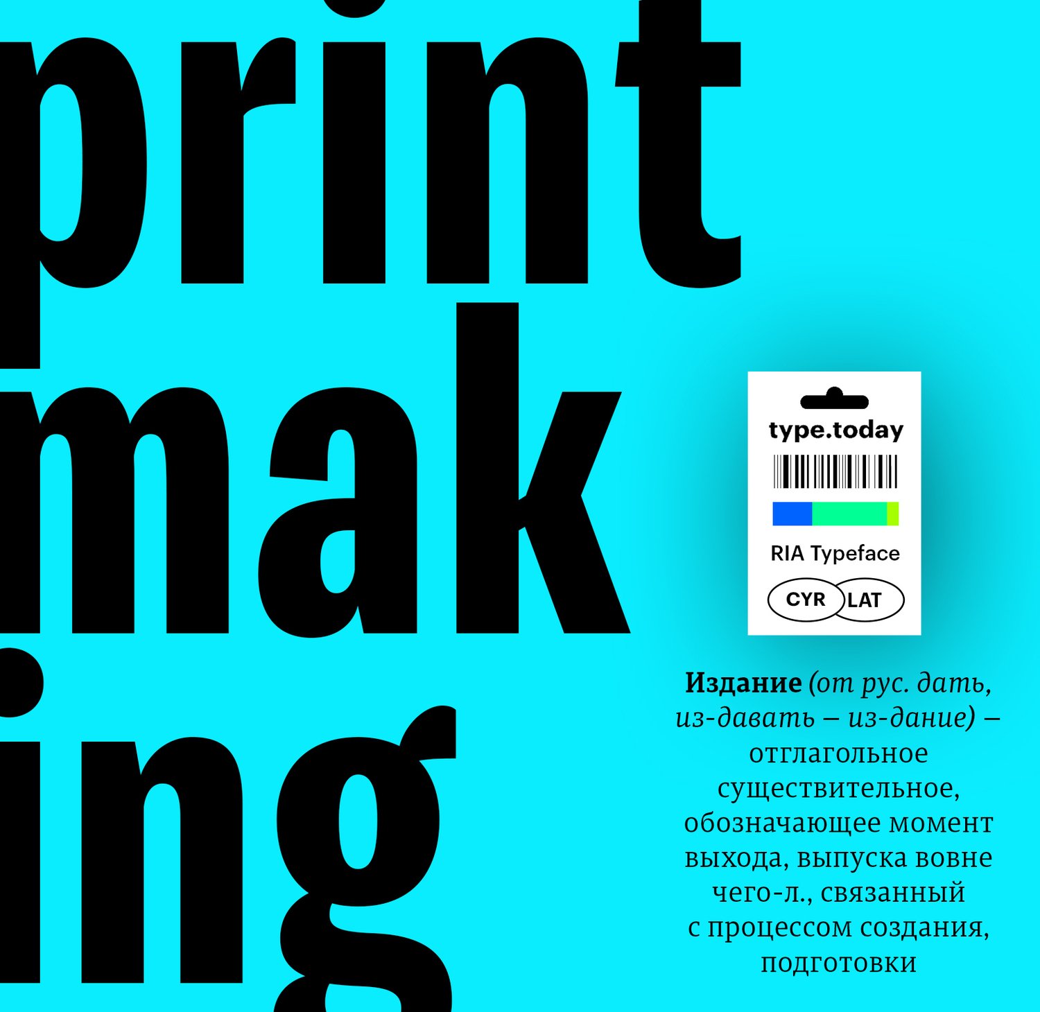
RIA Typeface is a font family created especially for the RIA Novosti news agency. Each face of this font has been created for a particular function, size, and usage context. Ilya Ruderman, the agency’s Art Director from 2011-2014, recounts the story of this font’s creation and its special features.

Background
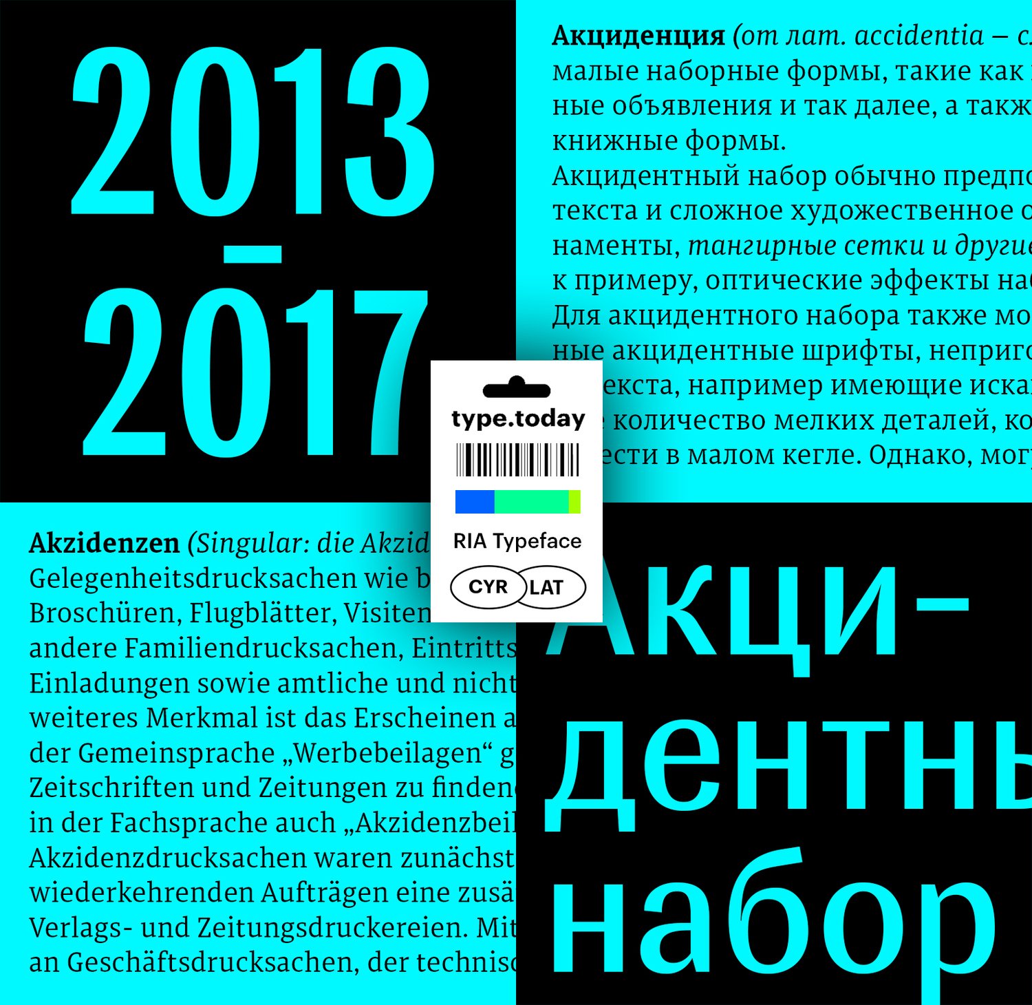
The project’s story began in 2012, when the RIA Novosti new agency was starting to think about rebranding. We were looking at an enormous amount of work to bring some order to the brands (of which there were about 40) and how they were communicated (which was incredibly diverse and chaotic), and to come up with a new strategy. To a large extent, this all fell on the shoulders of Marketing Director Andrei Sikorsky and his team. While the marketing people were sifting through the various projects and their brands, and testing them for viability, the design department were doing the preparatory work for the task ahead. Among other things, we had to decide on the set of fonts that would be used. We had basically two options: either find the ideal fonts on the market, or order new ones made especially for us. At the time, the market was modest in size, and the options that we could consider turned out to be fabulously expensive for such an enormous brand as RIA Novosti, with its millions of web pages and dozens of users within the agency. We were left with an option that would take more time, but be more precise and economical – ordering a new font.
**The project **
From the very start, it was clear to Yury and me [Yury Ostromentsky – editor] that we had neither the time nor the money to produce both serif and sans-serif versions over the whole range of font weights. An unusual solution was needed, and we came up with one — we decided to put together a font family consisting of individual faces to perform specific functions: a text face for text, a job font for headlines, a super-job font for advertising. It was decided we would furnish separate faces for infographics, which the agency was particularly interested in. It’s important to mention that at this point virtually all of the agency’s operations were web-based, and this is the reason for the majority of graphic solutions and the manual hinting of all typefaces. This is the structure we came up with:
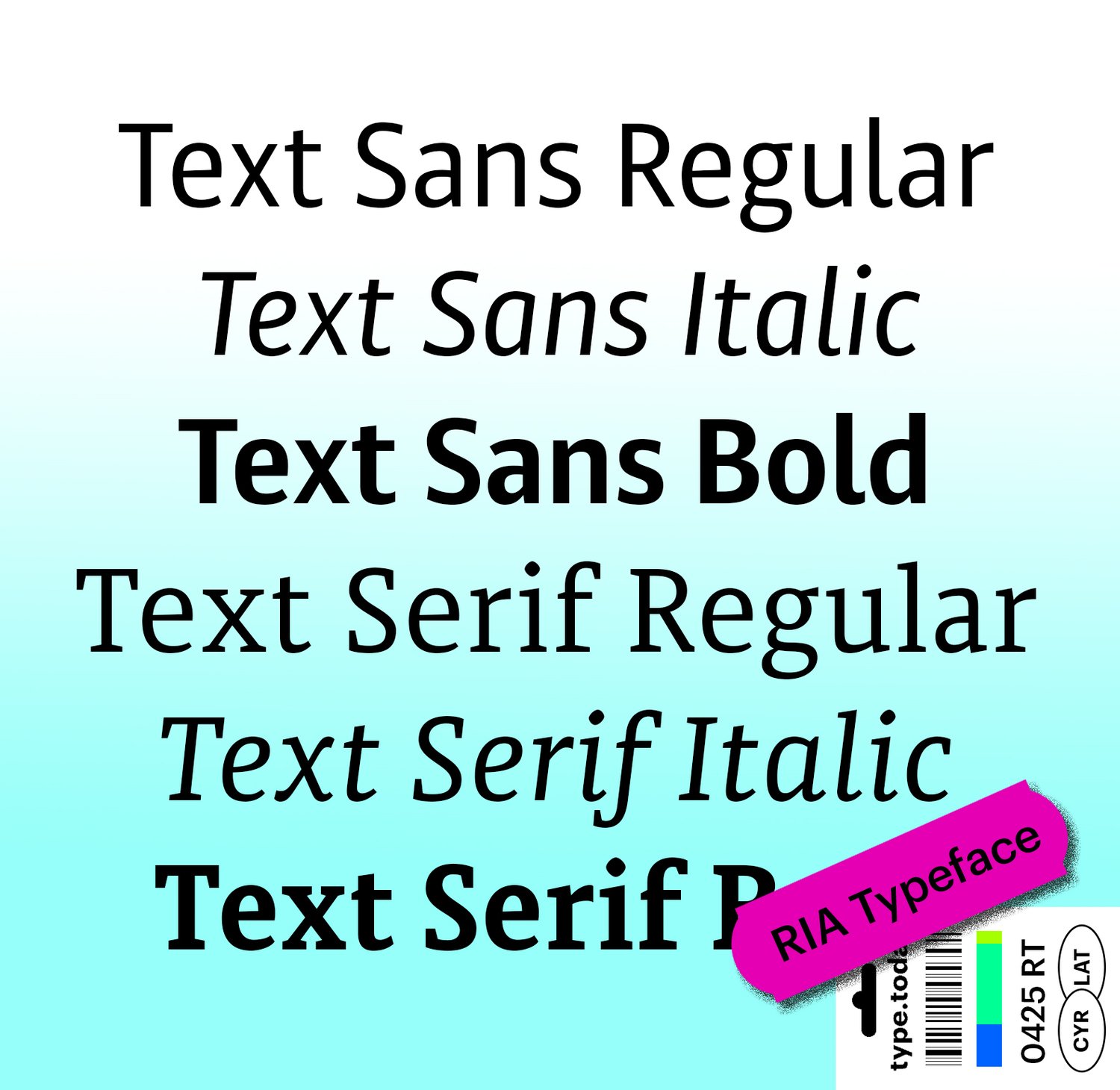

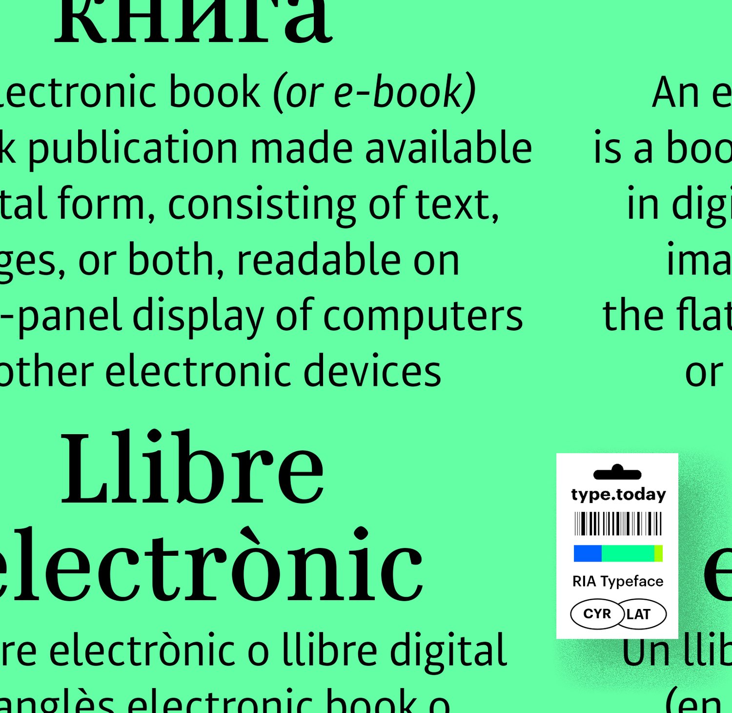


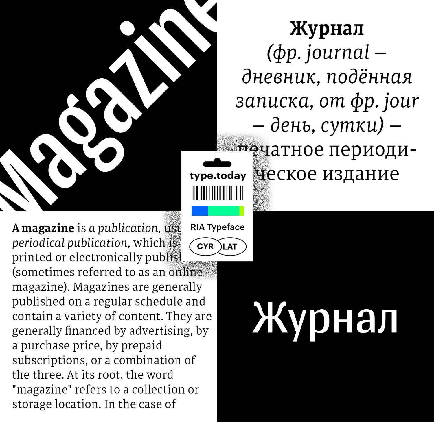
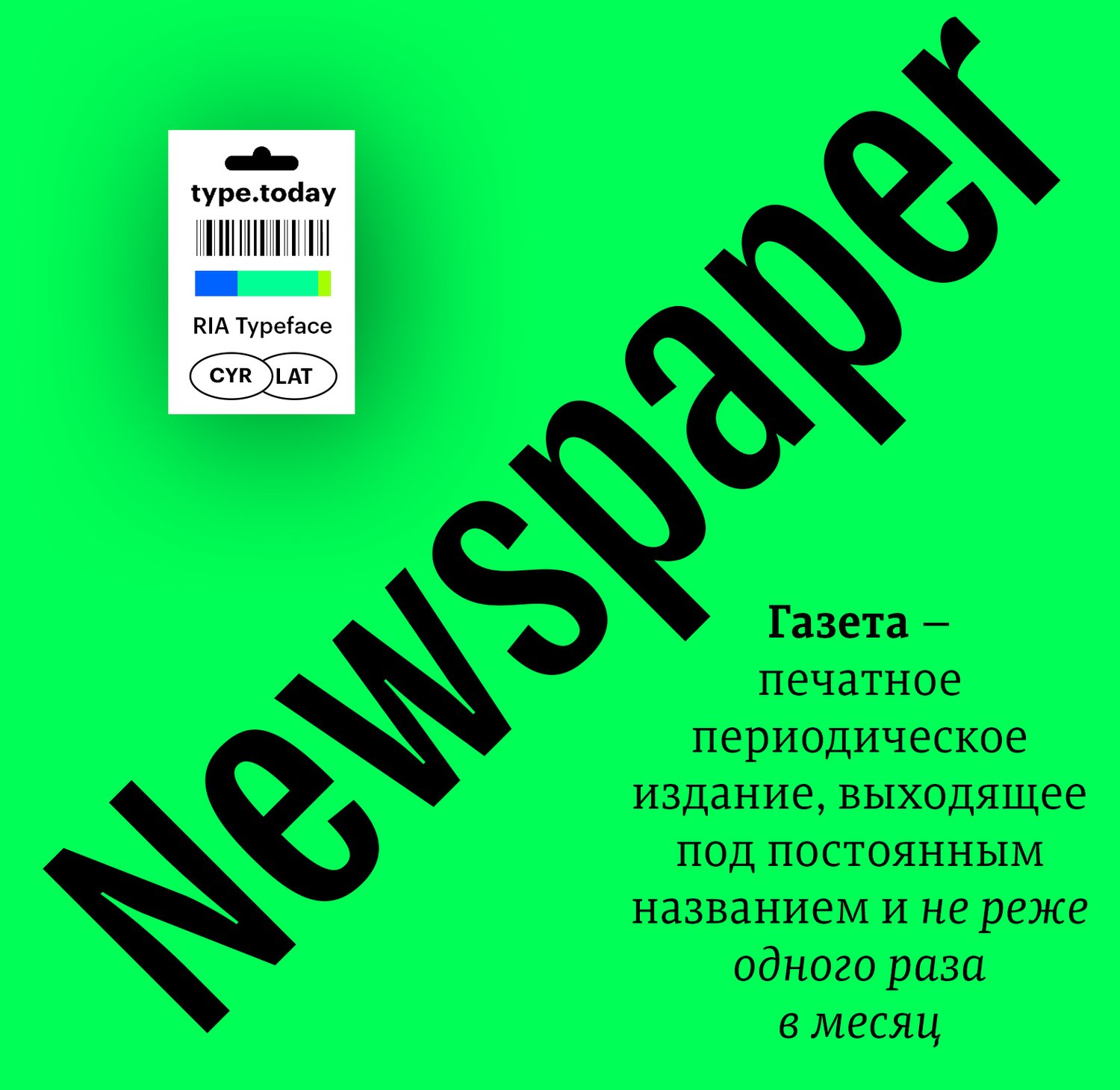
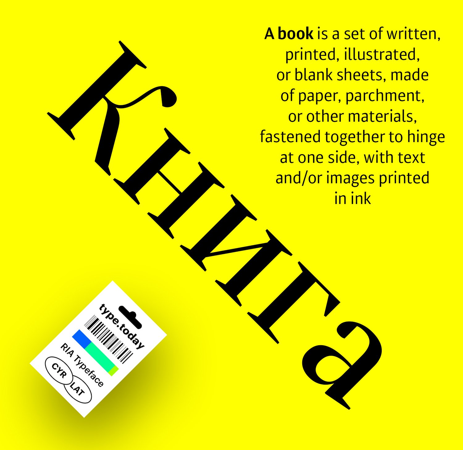
— Text serif and sans-serif
An ascetic set of faces for each: regular, italic and bold — nothing extra, nothing that is rarely used on the web. We planned to use the text sans-serif in the most neutral news sections of the site, while the serif would be used in opinion pieces and longer narrative texts.


**— Headline serif and sans-serif **
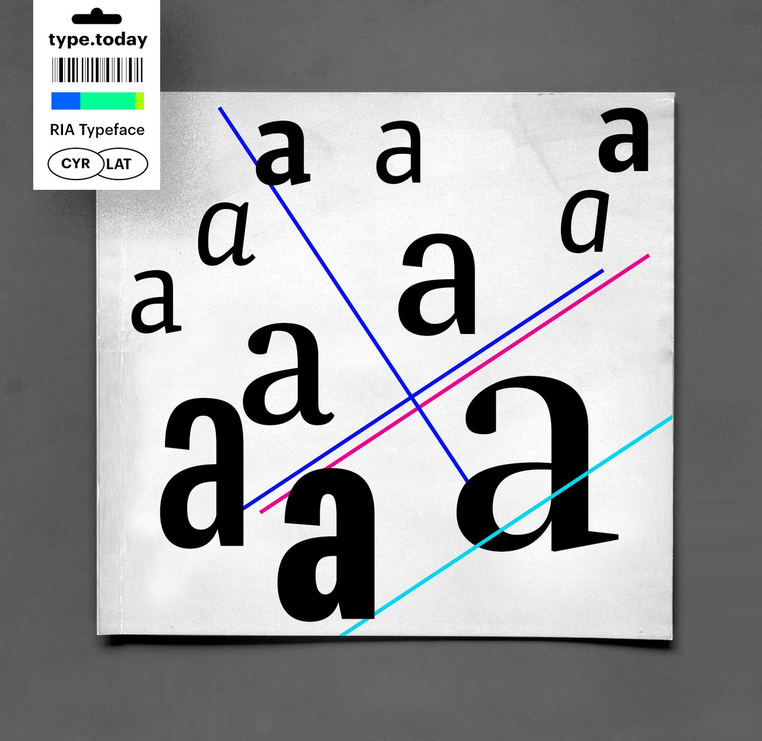
For the two individual text families, it would be strange not to bring in two faces for medium and smaller headlines. Here we should say that we tested not only text serif criss-cross against display sans-serif and vice versa; we also looked at more harmonious pairs as options.
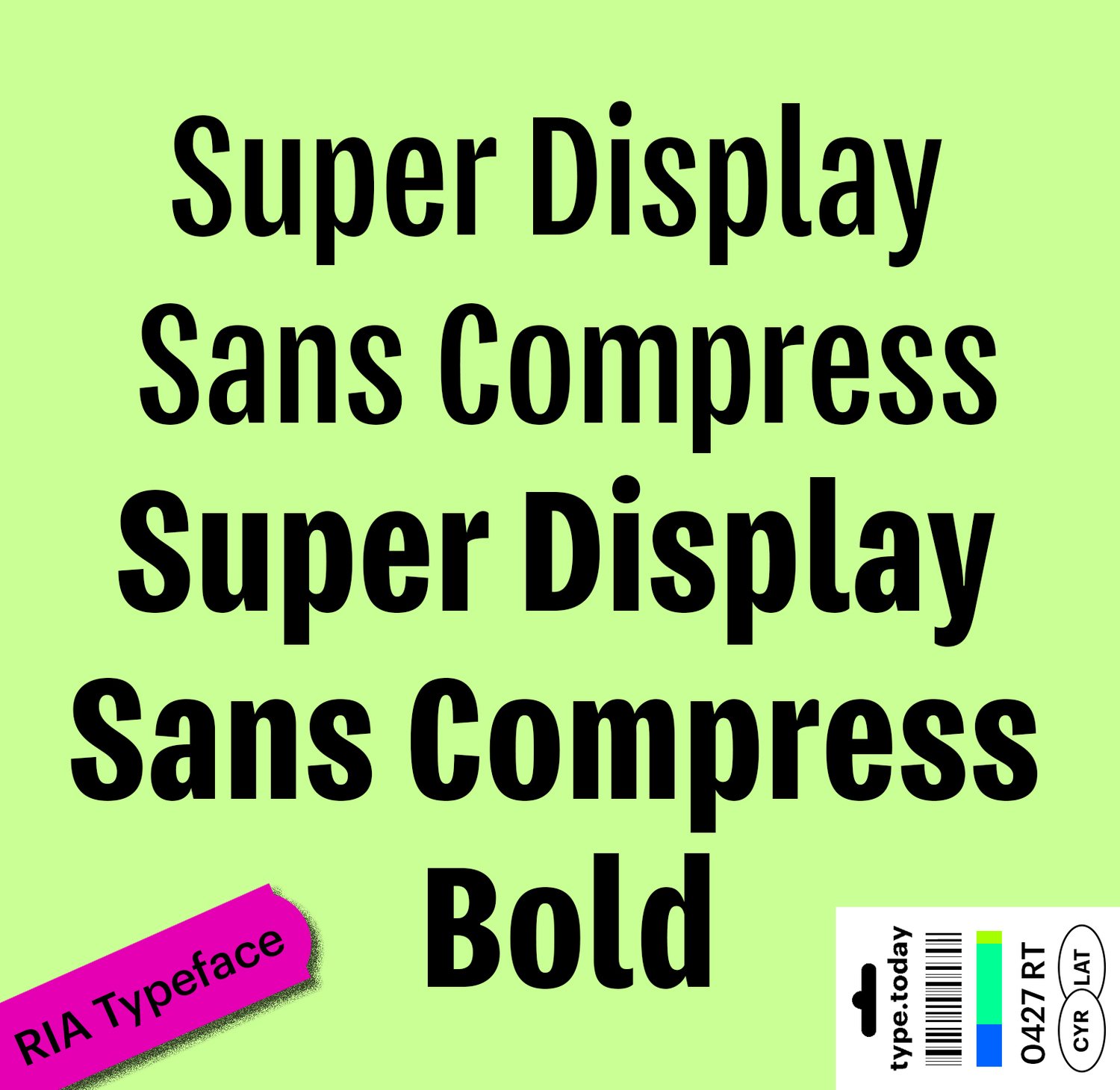


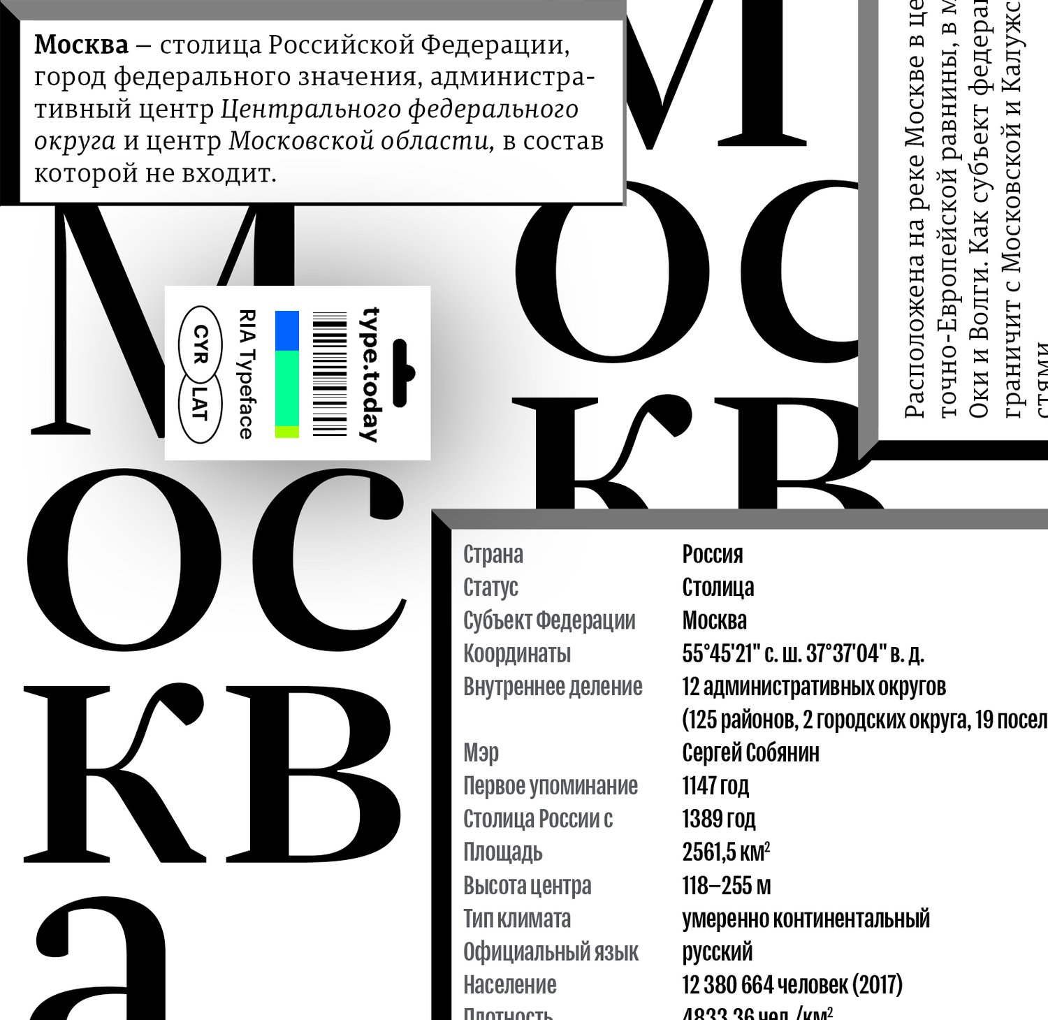
— Super-display serif and sans-serif
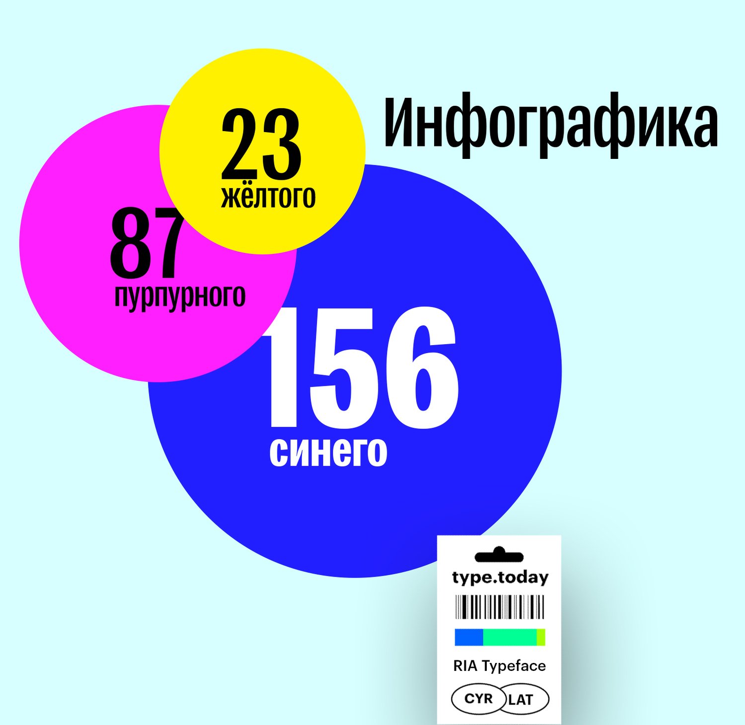
Here the purposes of serif and san-serif diverge strongly. Serif super-display was intended to be used in advertising and souvenirs, which is why it had fairly high contrast. Sans-serif was focused largely on infographics and on work in a limited space with a high information density. That’s why this super-display san-serif has two faces and very good legibility in smaller sizes: it is a super-display face and a compact text font for smaller texts at the same time.
Even though in the end the rebranding of RIA Novosti was not to be, for reasons beyond my control, I’m very pleased that this stillborn project helped such an unusual font family to see the light of day, and now that the exclusive use period is over, anyone can buy a license. Enormous thanks in this project are due to Svetlana Mironyuk, Andrei Sikorsky, Yelena Chepurnykh, Anton Stepanov, Vera Smirnova, and also Irina Kheyso (hinting), Igino Marini (kerning) and the team of designers at the RIA Novosti Design Centre.
P.S.: RIA Typeface won an award in the Contemporary Cyrillic competition in 2014, and a few months ago articles using the new font began to appear on the ria.ru website. And they look great there!