
First up — a point-blank question: how is the name of the Fud typeface pronounced — fud or food?
It’s food, because of the Czech pronunciation of the letter u. I started creating this font in my third year of university in Ústí nad Labem, which I graduated from last year. My Faculty of Arts and Design (in Czech: Fakulta umění a designu) made an open call for a graphic identity shortly before their 25th birthday. I decided to participate in it and create a font. So I named the files: Fud. I didn’t win the competition, but I had already done a lot of work on the font, and it was finished when Ilya and Yura asked me if I had something for type.today. And, as often happens when you have a working title for something, it exists for a few years, and you just get used to it. I decided to leave it as Fud, although I knew that there would be a problem, like with Druk/Drook.

The project Fud Grotesk evolved from
How did you end up in Ústí nad Labem?
I graduated from trade school in Chelyabinsk with a diploma in graphic design and moved to Czechia to continue my education. I got a bachelor’s degree in Ústí, and a year ago I started my master’s degree in Prague, at The Academy of Arts, Architecture & Design, UMPRUM.


Ilya’s student projects at UMPRUM
How did you choose your area of specialty?
From a young age I was always drawing something. But at a more conscious level, I’d say it mostly began with street art: the action of painting on the streets and altering surrounding spaces is still an important part of my life. Then I moved onto working on canvas and producing graphic work. And when I started drawing illustrations on the computer, I realized it is somewhat close to graphic design. But it was probably only in Czechia that it became clear to me that graphic design can be not only a pragmatic tool, say, to create advertising, but a creative process in which you can express your ideas — in a similar way to creating street art. And typography is probably the quintessence of freedom: you can often create work without relying on the whims of clients, and approach the result more creatively instead.
What inspired your move to Czechia?
I wanted to understand European design, and Czechia is a country with rich traditions in graphic and font design, which really attracted me. But on the whole it was more or less accidental. In addition, it is free for a foreigner to study at a state university — as long as you study in Czech.
Tell us about your education.
Everything here consists of the so-called ateliér system, which is a word for a studio — it’s a typical thing for all creative faculties. You come to study mainly under a particular professor or in a particular ateliér. For example, I studied in Ústí, where there were several graphic design studios; mine was called “Graphic Design 2”. Now I study at the type and typography studio in Prague.
Did you apply to study under a specific tutor?
As in theater schools in Russia, many people choose to study under a specific tutor and then say: “I learned my craft from them.” But I didn’t know any of this, because I had just arrived. I was learning the language and it was more difficult to understand how it all works. It was difficult to get into UMPRUM for graphic design — there weren’t many places. I applied for the BA programme several times, but I didn’t get in. Yes, and in Ústí they took only five students, and there were 6-8 people competing for every place. Czechia is a small country, and there are not many graphic design schools — in the state universities, for example, there is only one type and typography studio.
The studio in Ústí was led by Michal Slejška, a book designer, and Pavel Frič from monsters.cz. The curators of my current studio at UMPRUM last year were Tomáš Brousil from Suitcase Type Foundry, Radek Sidun from Briefcase Type Foundry and Karel Haloun. But sometimes they change: this year the new hosts are Filip Kraus, also from BTF, and Jan Čumlivski. In regards to the specifics of the educational ethos, there is a very free attitude to what you do — almost any idea is welcome. It takes a very long time to talk about a concept: why you want to do it, its form, implementation — then, and most importantly — to make them fit the concept. There’s a lot of discussion about every concept: you need to outline why you want to do it, consider its form, implementation and then — most importantly — continue to ensure that all these aspects are applicable and appropriate. In Chelyabinsk, they had a more commercially-oriented view, and we were constantly designing to fit a brief. This is not the case here: training is aimed at nurturing creative thinking among students and in translating this energy into projects.
What kind of projects are you currently working on in your course?
This year we had the following task: to create a new visual style for Czech ID-cards, driver licenses and foreign passports. The project was a collaboration with the state printing house, which produces these documents. A few years ago, the students came up with a new banknote design. There were quite a few unusual suggestions for how paper, physical money can look. As a result, the printing house approached the workshop again and this time, suggested that we think about new types of ID-cards. They gave us a lot of technical documentation, where things like what the watermark should be, the security design features, the color in the UV light were strictly laid out. There were also significant limitations with the layout to keep in mind: the family names had to contain 33 letters, while most Czechs have only five letters in their first names, and the like. It was quite difficult, but interesting. The results are on exhibition at the State Bank in Prague, where our workshop has a display space until the end of autumn.


Redesigning Czech citizen documents. Ilya Bazhanov, Barbora Haplova, Sergei Gavroche
Will they really be used for new IDs?
No, these are to show what it might look like. But this project calls for reflection. It allows us to start a dialogue with people and the government. Which I think is very cool.
Tell us about your diploma project, “Thaw”
This was created during my bachelor studies. I had always been attracted by old book covers, and I was keen to understand how fonts worked back then, and why they don’t seem to work like that now. In Czechia I saw how Frantisek Storm and Tomáš Brousil were reviving old typefaces, and it all looked really cool. Plus in Russia there is also quite a rich type culture. I focused on the Thaw period The Khrushchev Thaw is an unofficial name of the period in the history of the USSR after the death of Joseph Stalin (from 1953 to 1964), which was interesting for me both in terms of graphics and in general — as a time of de-stalinization, change, and the appearance of some kind of freedom. I started to read books about it, and I also learned a lot of information from the Type Journal — many thanks to them. The result is a book that consists of two parts: some research on the subject of types that arose at that time, and then my own typeface, which is inspired by book covers of the period. I tried my best to understand from my own sense of that eraand the feeling of today how it might all work in present times. But this typeface is not finished yet it currently has two styles, Light and Bold, and I’m now working on Superbold and Italic with a lot of alternative forms. That is, there are a lot of plans afoot — I’ve been working intensively on it and hope that you’ll be able to see everything soon.


Sketches for the Thaw project

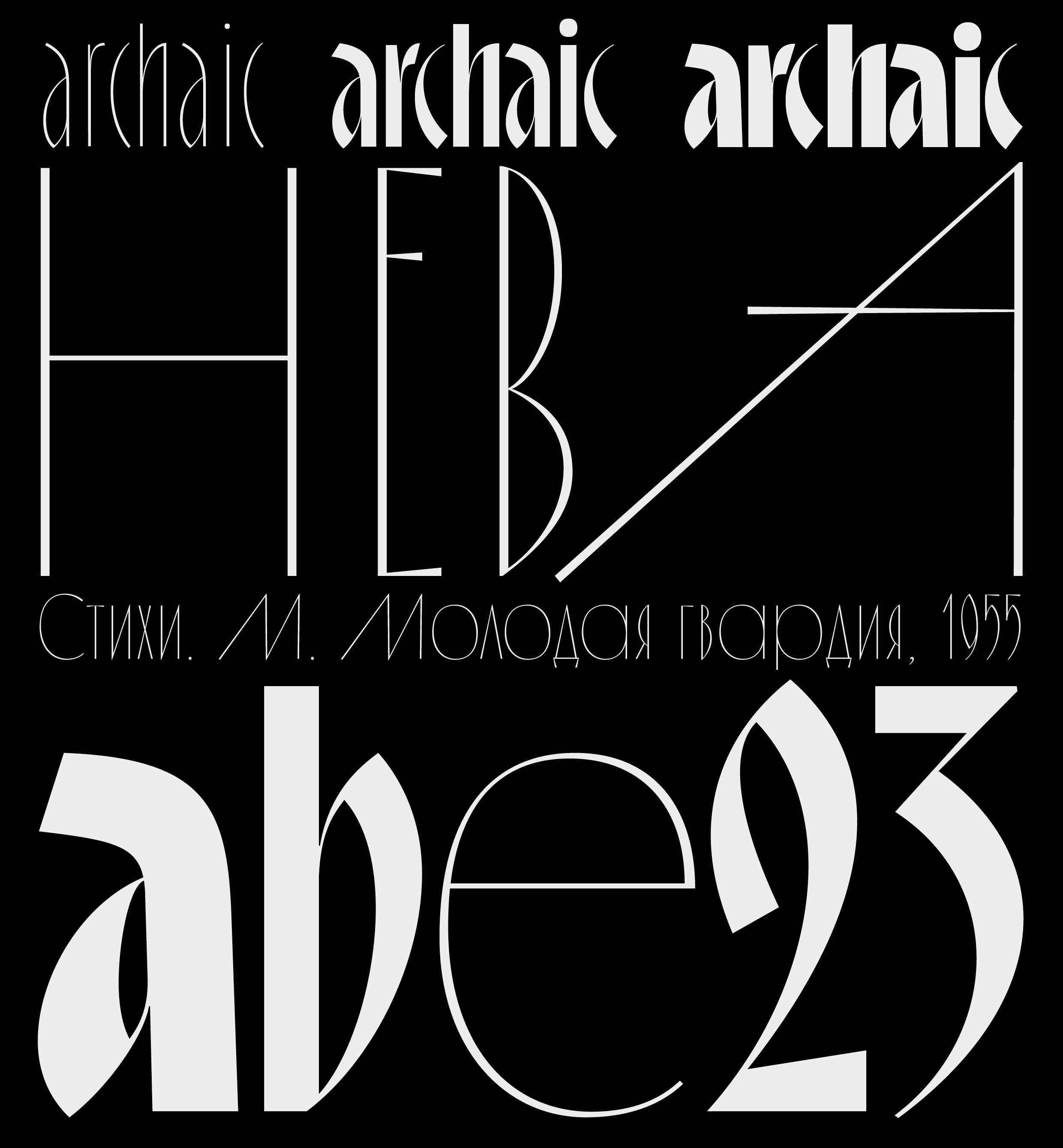


Thaw, the typeface and the book
When I look at your typefaces, I get the impression that you regularly refer to some historical specimens as sources of inspiration…
Yes, history certainly plays an important role. Of course a typeface is a thing that doesn’t come out of thin air. With art, many people try to express something completely new that didn’t previously exist, but with type it works differently. We can’t close our eyes to everything that has come before us. There is always history, well-established traditions, and it is difficult to make anything without knowledge of how it all appeared. In the end, if you change the letter a too much, it will not be the letter a anymore.
In my opinion, in Russian history — both in the Soviet era and before it — there are plenty of incredibly interesting things to consider and interpret. Many of these things have been forgotten, and we — the young generation — need to look at our history more carefully: there are a lot of things that will help us to form an identity — so that we do not create a carbon copy of other people’s ideas, ie: develop yet another iteration of Helvetica. Identity is a very important word for me. I think that is very important for type design, especially Cyrillic type design.
But your typefaces seem super relevant. What’s the trick to making them contemporary?
I don’t have an exact recipe. Probably, the search for inspiration or a curiosity about history is only one of the components, and there can be as many of them as you want. If you just redraw an old type and that’s it, nothing new will work. You need to take this sample and then do something else, say, to program some tool — that would be an actual step. Then, you have to make some other step. Basically, if you don’t stop at one thing, if you test several hypotheses at once, if you try everything, that’s how it works: in experiments with a 1% probability you will find some functional option. But this is an elusive thing — akin to magic or a signal from space!
What’s the story that inspired you with Fud?
I made a decision to no longer rely on typographic specimens, but rather on spatial ones — modernist architecture, for example, which I really like. There are many buildings of this style in Ústí nad Labem: the city was destroyed during the war and rebuilt again in the socialist period. My Chelyabinsk background must have influenced me too, because when I was there I often looked for deserted places to paint in: railway tracks, garages or abandoned factories. The vastness and brutality of these type of gigantic structures really moves me. I wanted to reflect this in the typeface with some unusual forms. For example, there are many unusual ligatures and small serifs in the letters.


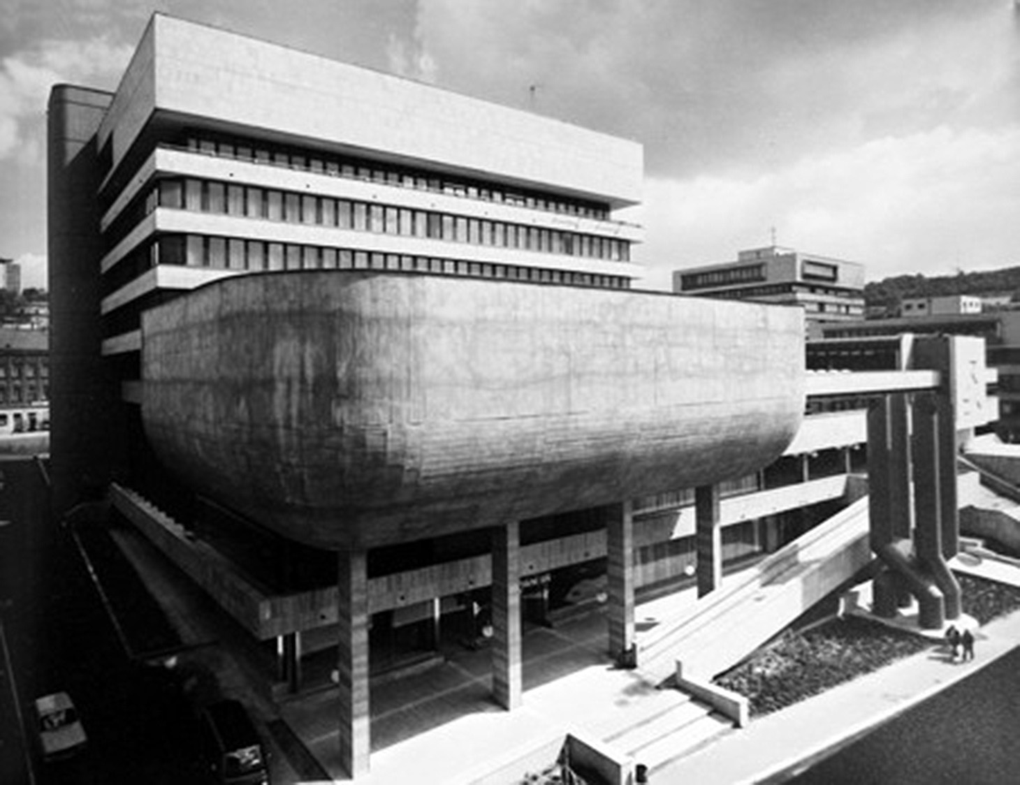

Office of regional government in Ústí nad Labem. Photo by Ludmila Hajkova
Chelyabinsk
Do you usually design a typeface starting with Cyrillic, or Latin?
It depends. I usually make a few letters: maybe the Cyrillic б is drawn, or something from the Latin alphabet — most often both. With Thaw, I first drew the Cyrillic glyphs and only then — not immediately — I went to the Latin. That’s why, as I’ve been told, my Latin glyphs have a tinge of Cyrillic. And I think that’s not altogether a bad thing, because usually Latin script strides ahead, and Cyrillic follows behind it, limping! I have already seen several projects where the Latin set borrows from other scripts — they always turn out to be interesting.
You said street art is an important part of your life. Do you still paint on the streets in Czechia?
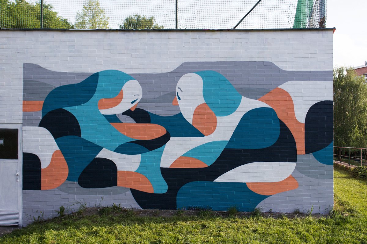
Yes, for example, all last week my colleague and I painted a mural in Ústí as part of the city project “Unknown Heroes of Ústí nad Labem.” Our hero was Heinz Edelmann — the illustrator who drew the Yellow Submarine for The Beatles. He was actually born in Ústí, but when he was still a child, when the Germans were deported from the Czech Sudetes after the war, he had to go to Germany. Unfortunately, when I started to produce a lot of design and typography, my capacity to create street art dropped dramatically. It’s quite difficult to do two concurrent things regularly and well. Now I’m mainly engaged in making digital things: illustration, typefaces, graphic design. Although I really try not to get stuck in this digitality loop. I don’t want to be constantly clicking on my computer. Sometimes you need to pause, to distract yourself by doing something else. Because there are many beautiful things we can create, aren’t there? Mural painting is the perfect break from my digital work.


Heinz Edelmann mural. Aleks Hue, Ilya Bazhanov, 2020

Water. Ilya Bazhanov, 2014
 Estrangement. Ilya Bazhanov, 2015
 Sympathy. Ilya Bazhanov, 2015
 Extrication. Ilya Bazhanov, 2016
 Addiction. Ilya Bazhanov, 2016
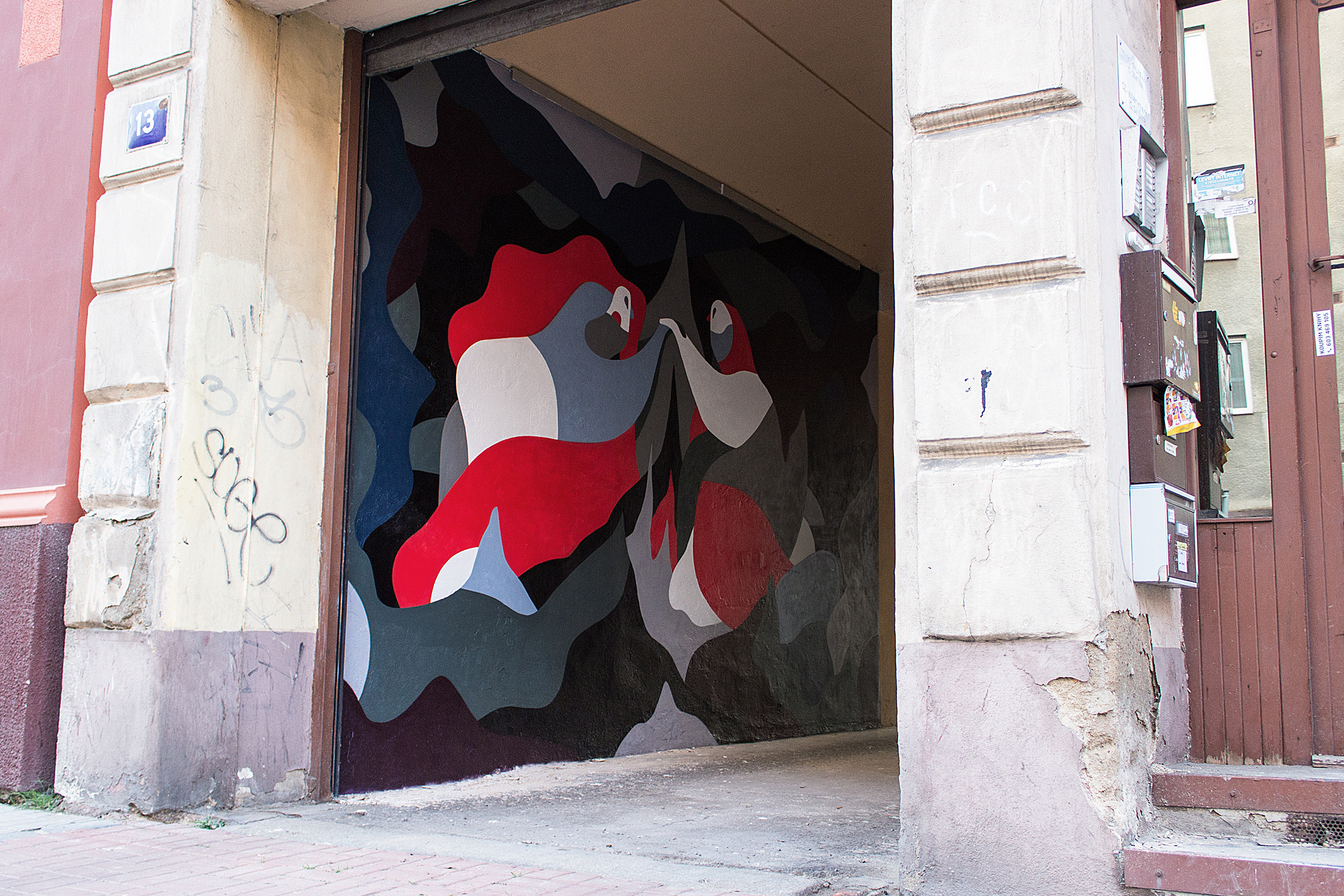 Internal Fire. Ilya Bazhanov, 2016
An artist working in analogue methods and a font designer are very different ways of being. How do you manage to switch from one to another?
Basically I came to graphic design and type from street art and painting. Both my works in the street and my illustrations are very outline-driven. I usually prepare a draft in advance: first a pencil sketch, which is then transferred to Illustrator and then there is detailed drawing and elaboration. When I go outside, I already know not only what I am going to paint, but also what colors I’ve chosen. That is, this process is structurally similar to graphic design and font creation, so it’s essentially possible to combine these practices.
It took me a while to get to producing type. Naturally, I was already gravitating in that direction because of painting graffiti, but there was always some fear holding me back. I think it came from my trade school education. I had the perception that type design was wildly difficult, that it was a gated community, and that it required some sort of special knowledge. Sure, nobody intimidated me on purpose, but this feeling was nonetheless in the air. Especially when you draw Cyrillic glyphs, it always seems that someone is about to wag their finger at you and tell you you’re doing it all wrong! But that’s probablynot always the case.
So how does one overcome this feeling of trepidation?
It seems to me that the main thing is to just start, and that teachers shouldn’t interfere with a student’s zeal too much. It is only then that a student will have the spark that they need, so they can do the hard yards to make everything better. Plus teachers have to understand when to say: “Don’t be afraid, everything is solvable.” This is especially true nowadays, when we have YouTube and so many tutorials — even from a technical point of view, everything has become much easier. Plus there are a massiveamount of texts available not only in English, but also in Russian — on type.today, or in Type Journal for example. There are also many good font designers in Russia, who you can write to and ask — they’ll always answer, and if not, then just write again!
But there is now a whole generation of UI designers who do not include typefaces in their field of competence at all: they either transfer the responsibility for typographical decisions to other team members, or choose a ready-made solution — Roboto with terrible Cyrillic, for example. And there is still very little professional criticism in our design sphere.
This will all be solved in time. More layouts with better typography need to appear. Our taste in type is instilled not only from education, but also from our environment. Today, beautiful things have become more accessible, because people seeapplication interfaces. Android, Apple or even IKEA have appeared, and they have set new standards for how many things should look. It seems to me that everything has become much better than it was. This is perhaps not immediately noticeable, but the visual environment has undoubtedly improved. Sure, we still suffer from bad habits. Because of Microsoft, people are not used to high quality Cyrillic alphabets: Times New Roman and Arial have become standard, and few people can explain why they are bad. But this situation can be changed as well. And it is changing: thanks to new technologies, the range of fonts is increasing, and fonts are much more accessible. The community itself — both graphic design and typography — is growing, more people are now involved in it. It has always been interesting to follow what’s happening with type design, and what I have seen in recent years, I really like: a lot of new and unusual things are appearing. Design and font are no longer topics for the select few.
So, everything will be all right with Cyrillic type design?
I think it’s unlikely to be bad, because it’s already good. It’s just good on a smaller scale, but it’s all improving, because good things always attract people. So sooner or later everything is going to be fine.
We still have to discuss Dusseldot. Tell us how this project came about.
I did an internship with the Erasmus program — any student in Europe can do one with a partner university. I thought it was a great chance to go and see how everything works in another country. I went to Dusseldorf, to the University of Applied Sciences, where some of my friends had already gone. One of the subjects I chose there was related to variable fonts: we spent the whole course analyzing them, and at the end had to present a concept for my own font. I’m a big fan of walking in general, and since I was located in a new, interesting city — I’d been walking around it a lot. So I thought about how to somehow convert my walks into a font. I wanted to understand how a static font can work with absolute abstraction. I started to think about what might work, because variable font technology has its limitations: the interpolation is not always accurate, the anchor points tend to go wrong . Then I met Max Barbulovic on the course, and we joined forces. I think it was an effective duo: Dusseldot was born when we combined our skills and started to walk around the city and record our routes with the help of a running application.
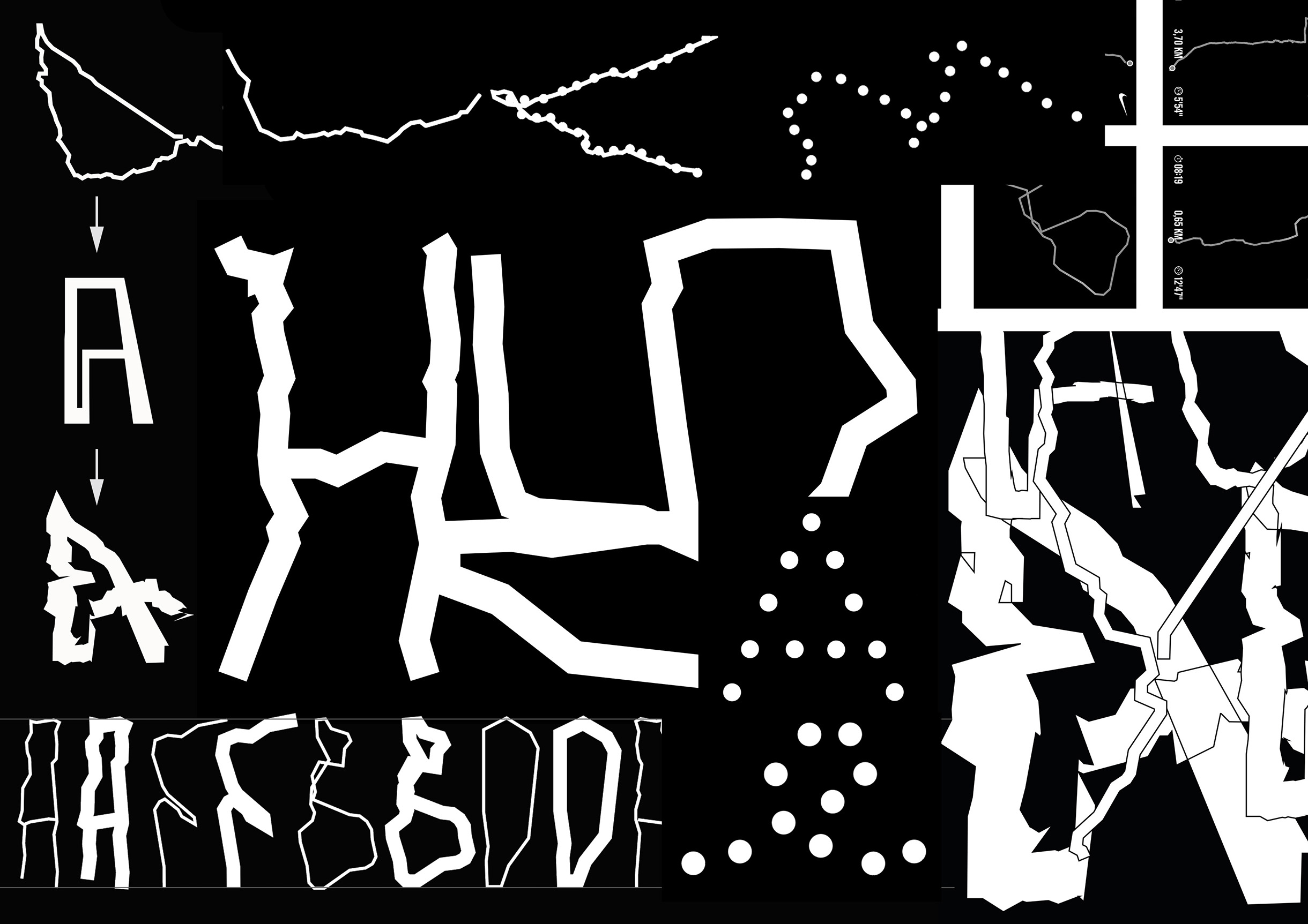
First sketches for Dusseldot
Did you really do as many walks as there are letters in the font?
When Max and I joined forces, the two of us did even more walks than that!
Did you walk together or separately?
We didn’t structure it like that: “today we’re walking together and tomorrow we’ll walk separately.” We just went, together or by ourselves, and tracked our routes.
Is there any relationship between a specific letter and a route?
No. If there was, that would add a new layer of meaning, but there was only one semester plus an internship to do it in. The city was unfamiliar — there wouldn’t have been enough time to correlate all the routes with letters. But if so, it would have been a completely different font with an absolutely different meaning.
Then how did you correlate letters and routes?
I didn’t want to complicate things: I just looked at how many dots there were in a letter and how they fit into the configuration of the route to smoothly transform it into a letter. For example, for the letter a, which consists of 8-9 points, I selected a short route that approximately coincides with these points. Of course, some letters are repeated. All accented letters are the same; you just add a couple of points to create an impossible sort of route. But we just wanted to make some sort of narrative with the in-between layers, in which the transformation occurs. It was really interesting to combine the non-connectable, to see how everything is destroyed and how a certain pattern and font are created at the same time. This deconstruction of the font, I think, helps to take a new look at the reading process itself. I would like to work further on this topic in general.
Have you already seen how other designers have used Dusseldot?
Not yet, but I haven’t looked. I’d be glad if someone could send me an example.
And how might it be used?
This is definitely not a versatile typeface. I would rather use it in some sort of a hyper-display context. It’s decorative: it can make interesting patterns for packaging or somewhere else. But best of all, I think it lends itself to motion design, somewhere on the web or in videos. For example, it can be used on a site where you need to turn something from unreadable into readable, let’s say that the user doesn’t know what it is at first and then they scroll over it, and it all comes together to make a word.

What possibilities has the technology of variable fonts opened for you?
I like it when variability can open up in motion, and create a process rather than just changing width and weight. You have to look for ways to change the structure of type with variability: like animation, and not letters but emojis, for example. I think I’ve already seen projects with variable emojis and even with variable GIFs. Yes, it was a font, but it had a color picture made of three RGB colors, and a kitten was moving around. We are able to create emojis and GIFS which are only a couple of kilobytes, and that can change a lot.
When do you think mankind last invented a new form in typography?
It’s a complicated question. On the one hand, I would say during the Renaissance, and this is something that has been with us for a long time already. But on the other hand, when computers appeared, the forms changed so much that we can say that new ones emerged. Then, new technologies appeared — variable fonts — and the form has become something else again. After all, this is all tied to technology, so everything’s constantly changing along with it. Even so: it seems to me that, more often that not, form catches up with concept and technology. Concept and technology, in my opinion, are always ahead, because form is something that somehow reflects the concept and technology in which it is created.
So we haven’t just spent the last twenty years recycling what was created before us? And is this part of the natural process that goes back to the times of cave art?
I think so, yes. The Thaw project made me very well aware of the fact that something does not come out of nowhere. Everything always has its background, which affects the current situation. But when we produce something today, we think and work in different ways than people who worked 50 years ago. The people who will be working in 50 years from now will have something new again. And overall, it’s a sine-like thing: a rise, a fall, then energy is accumulated again and spilled out as something new. In the 80s and 90s, after the appearance of computers, there was a type boom, but now energy is still accumulating. But if you look at other technologies, maybe now there will be a new boom there. It’s always very difficult to describe what is happening today. It is easier to see what has already happened or to think of some fiction about the future.
Ilya Bazhanov
type.today/en/designer/bazhanov
instagram.com/staticolors
staticolors.tumblr.com
flickr.com/photos/ilya_over