
Asya, your Behance profile doesn’t look like a profile of someone who recently was just a student. Do you have a lot of work experience, or what is it?
Yes, I actually do. Formally, I graduated with a master degree in art direction last year, at HSE Art & Design School, curated by Sasha Kuznetsova. Though, I have been studying for quite a while, and embraced design as a nondegree student with Higher Academic School of Graphic Design. It was back then that I met most of my friends and colleagues, including Esh Gruppa and Boris Trofimov’s Workshop. Later I also learned from Alexander Vasin at Т-24, and during all this time never stopped working. I was with the Jewish Museum and Tolerance Center for a while, making souvenir and promotional gifts. I created the design for an exhibition on Sholem Aleichem — you can see it on my Behance. I actually worked on many projects, only I never have time to put them online. I work mostly with museums and festivals which address culture, music and art. I prefer to apply my skills in this area.


Druk in the identity system and Instagram posters for Rainy Days jazz festival (Moscow and Saint Petersburg, 2019)
Asya, you’ve made use of our typefaces in your graduation project — even before we invited you to contribute our Instagram. Please tell us more.
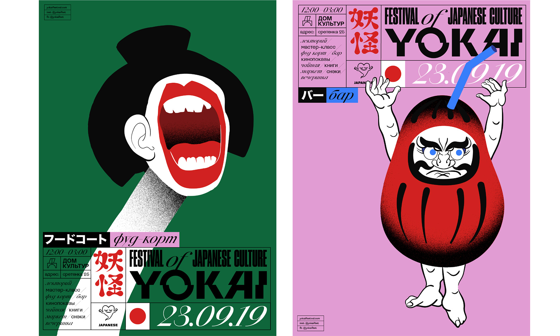
My taste for Japanese culture dates back long ago. It was about five years ago that me and my friends started this VK group called Japanese. I mostly did stories on design and art, contemporary and classic. I also took interest in Japanese folklore: exciting stories, incredibly whimsical monster images. I felt like what a shame there are no publications addressing this theme in Russian language. When it came time to think up our HSE’s graduate assignment — meant to be an extensive project on various media, — I decided to devote it to Japanese demonology. I came up with a festival’s identity, and then also made a zine. I engaged a great amount of illustrators, each figuring out his own way to interpret Japan’s folklore images. We produced a small research book. I was helped by one of my blog buddies, Nastya Yakunina. She wrote all texts and translated stories on the Japanese mythological creatures.


 ![yo3]

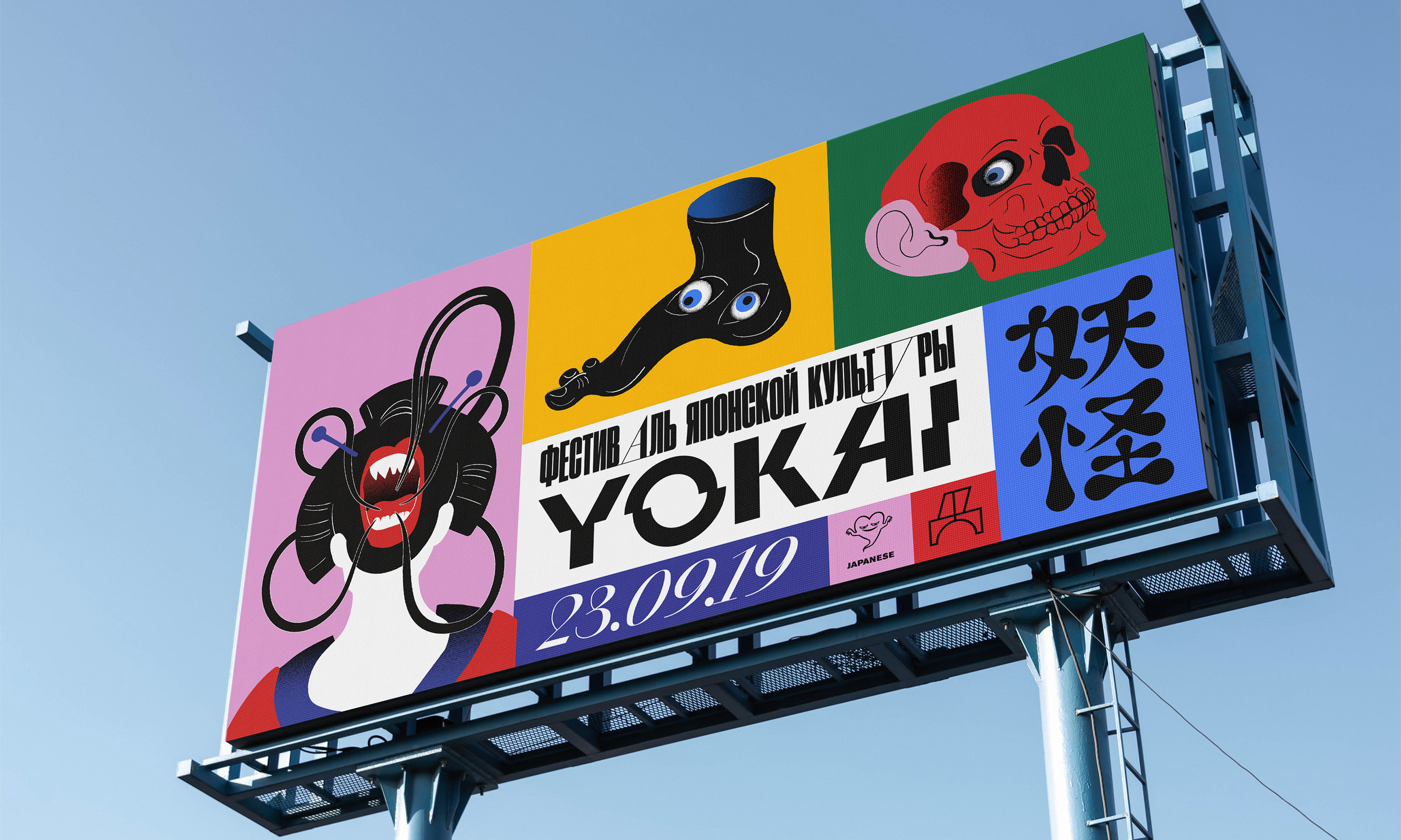


The identity system for the fictional Yokai festival, taking the name from a Japanese mythological creature


The small research book
And this zine has really taken on a life of his own: the one of presentations held and copies sold…
Yes. It just surprisingly happened that we presented it at the non/fiction book fair, like an actual, proper book. That was so cool! I’ve never heard of a zine to be independently shown at a book fair.


The Yokai zine
How did you find an idea of the font pairing in this project?
I attach high importance to typographic solutions. I enjoy working with letters, I do lettering by myself now and then. However, for text or display typefaces, I opt for major companies which produce stuff of proven high quality. The quality of your fonts is unquestionable, you have a wide choice in terms of the font style and personality. My graduation project was asking for something very time-relevant, up-to-date, easy-to-read, and yet somehow weird at the same time. But also affordable, it had to be a font of a reasonable price, — which was very important as it wasn’t a commercial project. I very much liked the CSTM Xprmntl series: I’ve been wanting to try those in practice, but there never was a good chance for that. This time I felt that Xprmntl 02 in Italic and Regular would work great, a perfect fit. The Regular is quite peculiar, highly distinctive — yet perfectly usable, it even works in large texts. The project also featured Druk Condensed. I love this font deeply, but since the Cyrillic release Druk’s become way too popular, highly overused now. This is the reason why I chose to go with its less popular faces, — extra narrow or oblique, instead of extended.
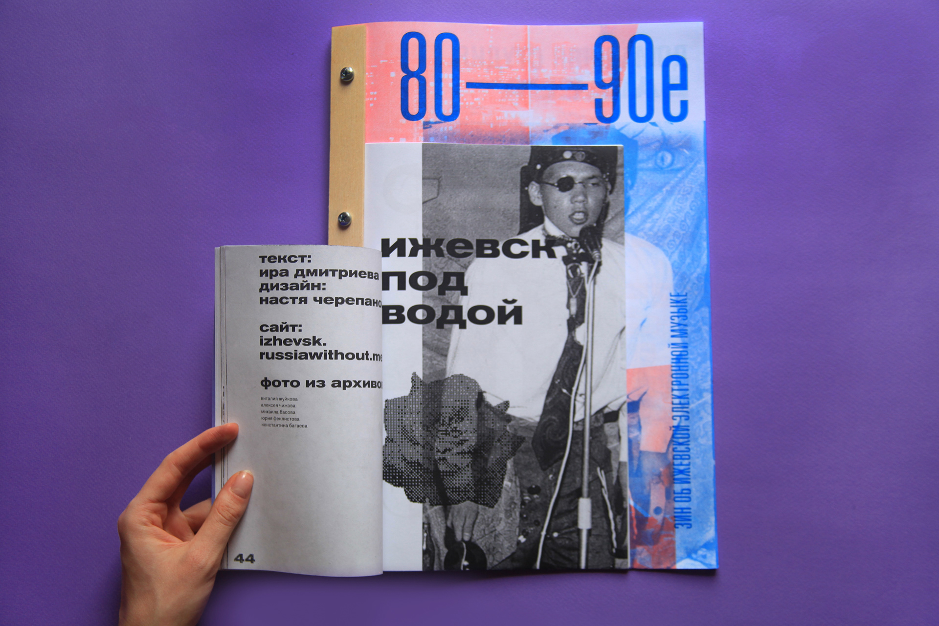
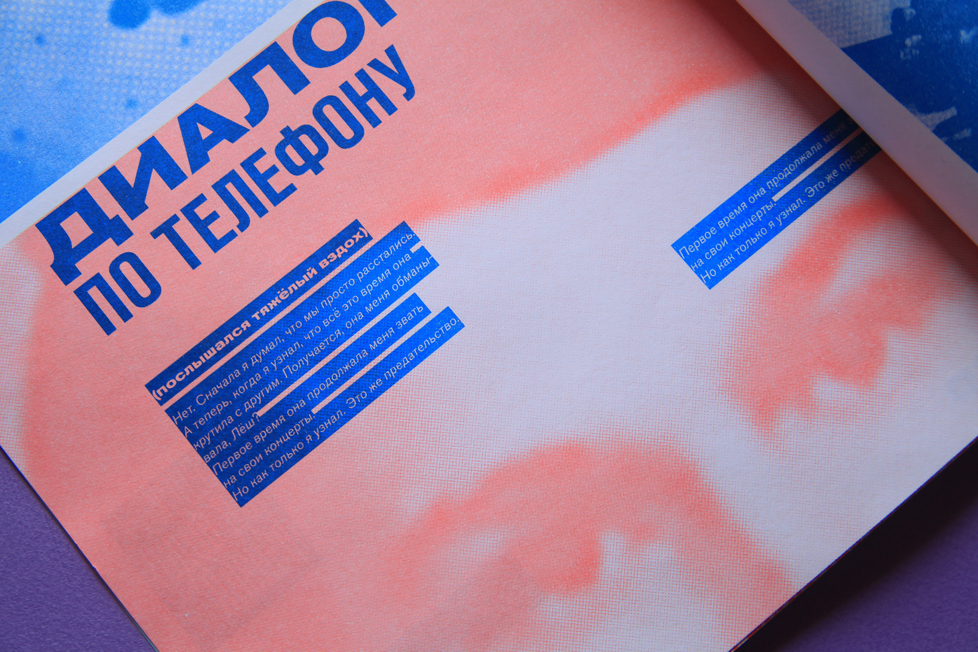
Can you tell us something about the other zine, the Izhevsk Electronic Wave?
It was my other school project, our first assignment at HSE. We were asked to make a zine on any subject you cared about or were interested in. At that time one of my friends, a very good journalist Ira Dmitrieva happened to work on a project about the city of Izhevsk, and so she made a great story about electronic music in Izhevsk of the 1980s and 1990s. I’d never heard of this before, while back then these young guys in Izhevsk did fantastic incredible things, music and absolutely mind-blowing experimental videos… I was really impressed by them. Ira and me, we decided to make this zine. And I love the result of our work. The assignment implied trying different approaches to lettering, and all of it were made part of the zine.


 ![iz9]
Are you saying all these crazy letters, it was your own experimenting with type?
Right. I guess my lettering experiments started with exactly that project. It became the first zine I ever made. I believe this medium actually suits me. I have already planned a number of zines about other things — it is actually a very free form, lots of room for experimentation, also relatively cheap in terms of production.
Where do you work now?
Yandex. Just lately I have been invited to work there as a graphic designer. We haven’t yet discussed exactly what I will be doing there.
As you take interest in typography, you might have something to tell us about some theme-based sources you check on a regular basis, besides type.today?
I wouldn’t say I have a fixed list of sources. Pinterest, naturally, — perhaps it’s too obvious, but I really go there a lot. What else, certain major media sources such as It’s Nice That. I am following many type designers and those who are somehow experimenting with type on Instagram. I perceive it more as some kind of a daily visual flow running before my eyes, rather than as a certain list of separate sources. Speaking of Russian-language sources, I read the articles and books of Schrift Publishers. This is probably the primary source of texts on history and theory of typography in Russian language. Beyond that, I routinely check postings on type.today, especially your Type Digests on what’s new in the market. These compilations are very helpful. It’s hard to keep track of everything new, and that’s wonderful to have all the information accumulated in one place, — and with useful comments.
Is there anything else you’d like to see? Your idea what’s missing?
Apparently, there are some practical issues that have not yet been addressed in Russian sources and therefore I wouldn’t find the answers there. Like, within one of my recent work projects I did this experiment when I tried to create a logo with the use of variable font. And I was helped by Yury Ostromentsky. He advised me on this thing, practically saving me, — as I had absolutely no idea where to start, how it works, what might be done. You do find all this in English — but typically, for a piece of information like that, you have to look in the software guides.
And I’ve always wanted to work with type and draw letters myself, but I was crazy scared — also no idea where to start. I tried to read Gordon, maybe do things, but to me it looked like such an enormous, very complicated structure. Sasha Kuznetsova has been a great help, introducing me to the basics — it was, roughly speaking, just four simple steps to help you start drawing letters and building up a typeface. It might turn out awry, totally incorrect, with clueless mistakes, — but it will still be a real typeface. I believe it’s things like that, that a student could really use — a student who is willing to experiment, but doesn’t know where to start. Also probably some practical information on font pairings, stuff like that. Readymag, I believe, recently began making some steps in this direction — it was literally just four entries they published. It will come with experience, you’ll learn to navigate, find your way around such things — yet I remember how desperate I was to get this information a few years ago, and how hard it was to actually find it.
Now let’s talk about type.today’s Instagram. Let’s say you get the key — the collection is all yours. Were there any typefaces you already knew and enjoyed? And what was yet to be discovered?
I’d already used only a few of them in my work — Kazimir, Druk and a couple more essential typefaces… Most of the others were practically new to me. I was eager to try it. I’m afraid I can’t say there were some specific typefaces that I wanted to use more than the rest. Let’s just say it was all clear with display typefaces in the collection so I was more eager to meet its workhorses, especially serifs. Totally loved the serifs. They were a lot of fun working with, serifs are insanely beautiful. Getting started to create a poster with one of your serifs, it was pure bliss.
Which items took to you most of all?
The ones I used for my Fellini’s Casanova poster, Austin and Vesterbro. I clearly remember typing in the letters and thinking of how beautiful they were.
Speaking of font pairings, how would you explain to people if any given pair works together or not?
That’s a tough one. Today I am taking an intuitive approach, I guess, — which is simply a lot of trying, experimenting, and looking around. While earlier I used to thoroughly analyze the forms and proportions, finding a match based on structural and constructional rhymes in the letters. I reckon that we need to take into account the time this typeface was created, too, — to avoid combining typefaces from different backgrounds and contexts. Then again, doing so is another possible typographic solution, why not.
Any other fonts you’d like to mention?
With regard to what’s beautiful — one might say florid, — that is most definitely Dala Floda. Its letterforms are so beautiful that you could put just one and it will be enough for you to keep staring at it.
And which of your pictures do you like?
I feel good about my posters. I’ve been wanting for a while to do posters for the movies I like — as soon as we discussed my participation, I immediately thought of it as a good opportunity to put this idea into life. And I like what came out of it. Arranged in high spirits, my posters are not that bad in terms of typography either. I am happy with Casanova. From what I can see, Psycho turned out rather nice and so did Akira.
What came first, the movie or the typeface?
With posters, the movie came first and then I picked the typeface. I was sure about the choice of films, more or less, — and went after a typeface to match the style or the sentiment of the movie. Considering possible options, I looked through a number of fonts, and that’s how I discovered them. The whole process was rather quick. I liked working with your fonts, makes me wish to use them someplace else.
All in all, the month with type.today offered me ample room for experiments. Basically, I produced one picture a day. So, I had to come up with a smart idea and its graphic representation, — given that everything had to be done very quickly. It was fun to watch people react. Some things catch on, others don’t.
Have people responded the way you thought they would? Didn’t it match you expectations?
It didn’t, sometimes. Like, I feel that movie posters weren’t so popular as compared to other posts, while I figured it was the most exciting of all the things I’ve done. Movie posters were getting less likes than funny pictures with simple slogans, such as Punks not dead or Winter is coming. Or another example, they all liked this simple picture with stamps — probably because of its structure. Perhaps, people loved the idea of creating a product like this, seemingly real.
So your conclusion is that the simpler idea and structure are, the better it is received on Instagram?
No, I wouldn’t say so. My guess is that smart ideas are always bringing attention. A joke or a striking image are more likely to resonate with the audience emotionally than oversaturations with visuals — for there is already too much of it. We have too many design publics: posters, banners, all kinds of graphic design, lots and lots of it. That’s probably why people are more attracted to simple stuff with a smart idea, or a kinky stunt.
Have you prepared anything besides movies? Was it always just one day to figure out the whole thing?
I made use of a few drafts I had. Yokai Fest and the matchbox, those are from the graduation project I mentioned. Then there was this picture about the jazz fest, with letters shaped like rain drops, — this one was also from a real case when I worked for a jazz festival in Saint-Petersburg. Other than that, every day I just sat there, trying to think of something. At some point during the day I have an image or an idea coming to my mind. Such as Be ultra bold. Be as brave and cool as Pilar. Sounds nice, I need to create a picture. Or take this image, chess with two Karloffs. I actually like this approach where you have a pair of fonts in opposition to one another. Everything was spontaneous, and it was really exciting.
All right, the last question is our favourite. What happens tomorrow? Where typography is heading?
I truly enjoy witnessing how type is developing right now. We see lots of bold display typefaces and projects arrive. Visualizing typography in the future, I think of letters in the context of AR, or VR. I really look forward to further development towards this direction and I would want us to walk away from conventional approach to type — I wish to see everything being translated into multimedia, shifting to physical space, to some sort of multisensual dimension. I feel like experiments where typography is getting syncretic, with the typeface having sound, volume, light, even taste. That is more or less what I want. I can’t tell whether or not everything is going there, but that would be awesome.