
Sasha, you are very young and already quite a successful type designer, but you didn’t get any long-term professional education…
I didn’t get any professional education at all. Only real work experience.
How did it happen that you ended up doing type design?
I started not at all as a designer; I coded. First, I developed websites, then began to draw them, and after that took interest in books. At some point — in 2015, I believe, — Druk typeface arrived, but it had no Cyrillic set. And I really wanted to use it in one of the zines that I published then, and so I tried to design a certain wry version of something Druk-ish.
Can you elaborate on the zines?
I’ve always been into website design, because that’s the market now — and you can’t do nothing about it, — but I loved both books and music. When I got to know the music of Grazhdanskaya Oborona, I realised how powerful in the 80s and 90s the culture of samizdat was. Such as KontrKultura magazine. About six years ago, I discovered for myself other Russian designers and today’s design community in general — and got carried away. I designed tons of things. It was an attempt to launch our own small publishing house: we printed our zines with a risograph, made E-zines that I coded myself, issued small books — mainly stories.
Meaning, you graduated from high school and began doing design?
I began designing even before graduation. In fact, I didn’t even get a high school diploma — I got expelled because I skipped too many lessons, working and writing stories and poems instead. I started designing when I was 12, in Novosibirsk. I began making magazines — of a very poor quality — about gaming and other stuff. Just saw Afisha and Esquire magazines at some newsstand, and understood ‘that’s it’. And that was the good old Afisha of Misha Smetana and the good old Esquire of Maxim Nikanorov. Later I moved to Moscow, where I went through some psychological issues that prompted me to make a zine. And after that there were lots of zines — in 18 months we issued about 20 printed zines, 10 web zines, plus a number of audio ones, and so on.
And you just decided, ‘I think I’ll make a typeface for the zine…’
Exactly, I simply decided to design a typeface, although earlier I thought that you needed many years of training to draw even one single letter…
Most people think that…
And they are probably right. But I just can’t choose easy and right ways of doing things. I always act somehow chaotically and emotionally.


The Armillaria Zine (2017)


The Catastrophe Theory Zine (2017)


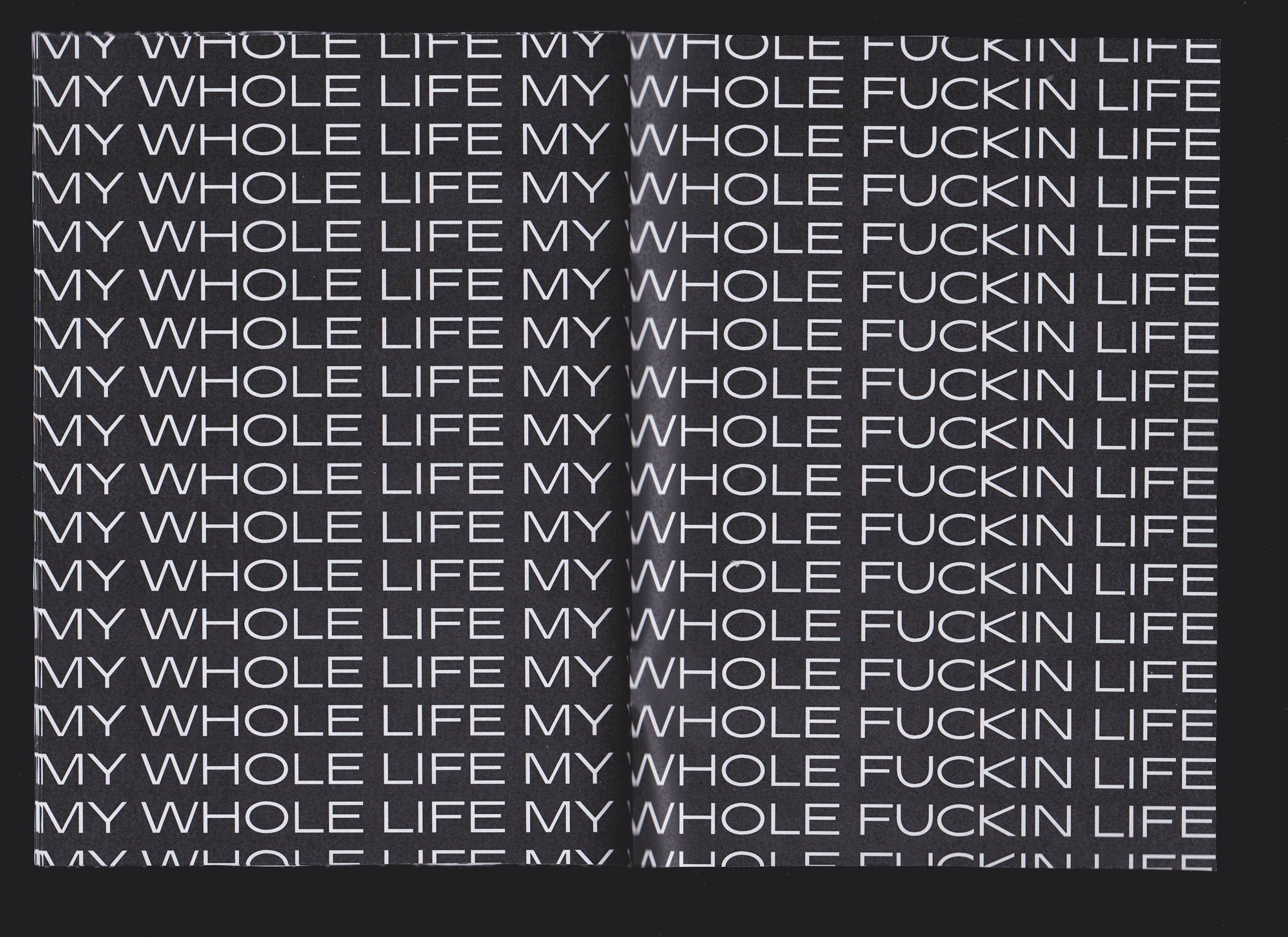

The MY WHOLE LIFE MY WHOLE FUCKIN’ LIFE Zine (2018)


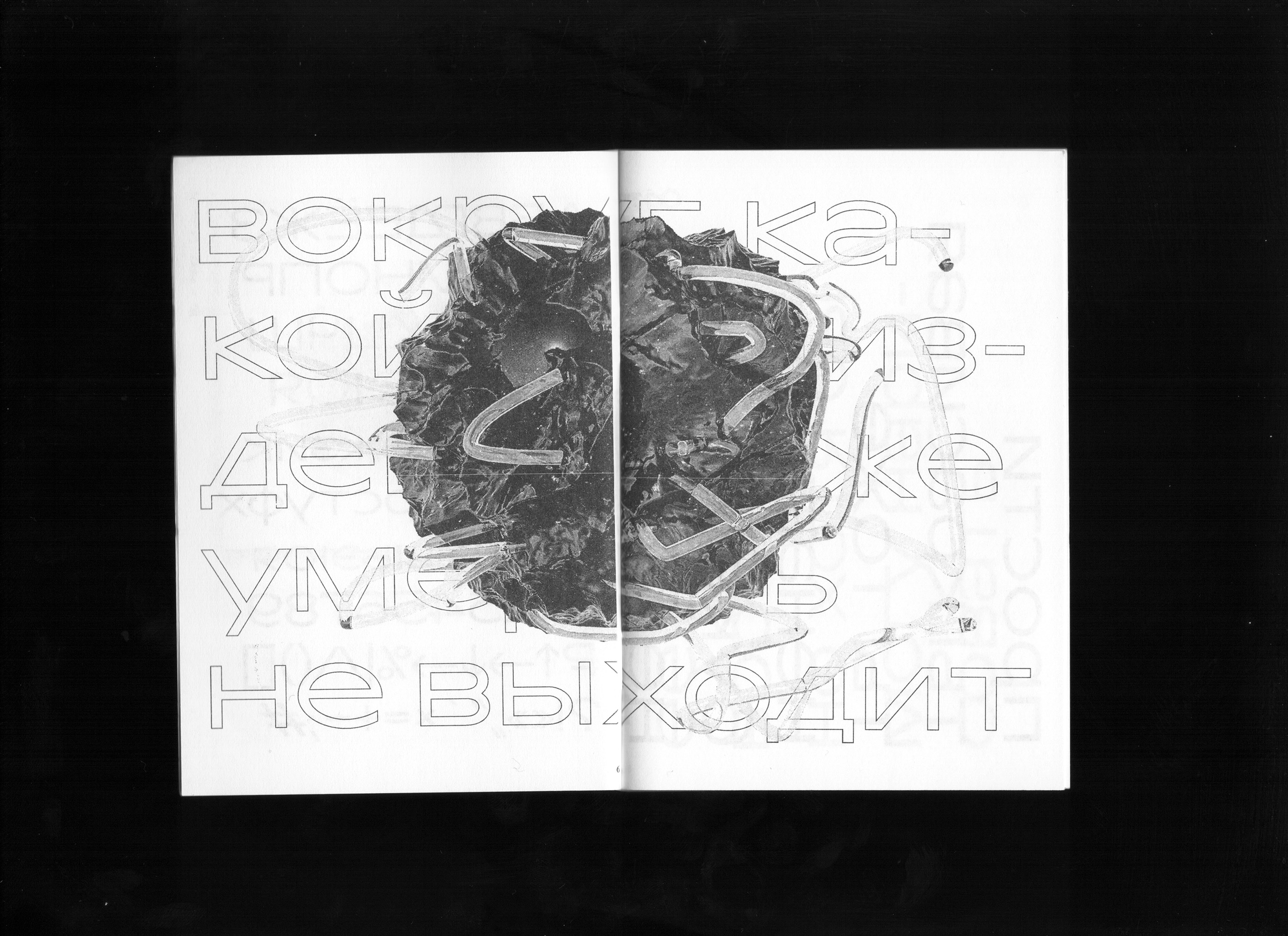
Other zines
What did it take you to draw your first letter?
I opened Pinterest, pinned letters which I liked, started redrawing them in the Illustrator and realised that it wasn’t at all what I needed, because curves in the Illustrator are CURVED. Whereas I wasn’t, unlike many others, planning to start from copying Futura: I decided to embark on something interesting right away and deployed Glyphs, as there it is possible to correct letters, one way or another. Later, at the Type Design Workshop of Maria Doreuli I got hooked on RoboFont, and it was very difficult to get off this thing. Now I’m working with Glyphs, but planning to start coding in Python and get back to RoboFont — its interface resembles an aircraft cockpit, and this is nice: it makes you feel like you are working not on some fake stuff but on a complicated system and structure.
Please tell me about the Type Design Workshop.
I had already written many good things about it, and have only positive feelings about it. That was a great experience, and I tell everyone that this is an only field-relevant education in Russia that you can receive in a rather short time: they won’t teach you how to draw typefaces — that is a long process, — but they will teach you to understand them and tell you why one should pay so much money for it. I still sometimes talk to Liza Rasskazova, Maria Doreuli, and Nikita Sapozhkov, seeking their advice. I still wanna get back there, even though it’s been four years since then already. I didn’t talk much to teachers while I was studying there, since I was rather tense, uptight. For me it was difficult to approach the very same Tarbeev, for instance, talk to him, ask him questions.
Did you have zero knowledge when you got there?
No, I already released the first version of Transgender Grotesk, but I was rather a germ of type designer back then. I started looking up to Timur Zima, and this had a very strong impact on me. In my head I began to compete with him. If it were not for his type works (which he intentionally calls graphic ones), I would not have released the typeface. It was quite important for me to succeed, to overcome, to become stronger and more powerful.


Transgender Grotesk specimen zine, 2017 год
Are you planning to somehow continue your type education?
I certainly am. I want to go to The Hague — as Anya Danilova put it, that’s ‘the Hogwarts for typographers’. It is not that simple to become a type designer — you can’t just sit down and start drawing letters. When I had this critical moment — the moment I realised that I didn’t want to do design, but I do want to draw letters, — I asked Yury Ostromentsky, Maria Doreuli, Roman Gornitsky for advice. Over time I got accustomed to the idea that for allowing yourself to study in The Hague you have to work as an art director for some time. And over the last couple of years my desire to go there has only grown bigger.
How did Transgender eventually end up in the Tomorrow catalogue?
Once, a long time ago, I posted it on Facebook for free download — it had only Cyrillic, very awry, no optical compensation, nothing. At some point I was approached by Yury who suggested I had to finish, complete the typeface. I received his message while being at Timur Zima’s place, and we both were very surprised. I literally shouted with joy. I sent Yury all the files, came to his studio, and he sighed heavily while looking at the prints, took a red pen and crossed it all out. I even got a bit depressed — even though I understood the typeface was raw. So we were meeting once in a while for two years and six months. I often cancelled those meetings — not because of me being lazy, but because of my psychological problems and other things, — and because it was hard for me to draw. But this has been the best experience you can get: you’re sitting next to a person who knows a lot and understands things, and you trust them.


Transgender Grotesk test sheets with revisions
Should we expect the release of Transgender Bold?
Hopefully, yes. Everybody asks and waits for it. And Yury has already told me many times that all it takes is just to draw. But it is hard for me. And so the typeface is less used, since it has only one style. Had it two, it would be everywhere.
How did you come up with this name? It is quite advantageous from a commercial standpoint, as it is easy to remember. Were you counting on that in advance?
I wasn’t. For me, it wasn’t a task to solve — I was simply expressing myself. This name doesn’t resonate with the actual letterforms and glyphs — there’s no transgression, transition, whatnot; what there is, is my personal experience as an author. I was creating a typeface for the zine, but it was only partly material, in other part it was the continuation of what I felt, experiences, where I was. It got this name because I suffered from significant gender dysphoria. I was wondering whether I should rename the typeface for releasing it on Tomorrow, as in Saint Petersburg, for example, there is an official ban in place on ‘propaganda’ of transgender identities. I wrote a post on the subject, and Philipp Neumeyer wrote to me that I shouldn’t change it, that it was a good name and I should keep it. After a while I started receiving comments from other people and realised that the name had turned into an independent statement: I make the word ‘transgender’ (that has many negative connotations) normal, I reclaim it. It is just a word that you use, same as ‘graphic’, or ‘Kazimir’. People say ‘transgender grotesk’, and what stays in their minds is that ‘transgender’ is not a swear word, not a bad word, but just a name, and a simple fact.


Transgender Grotesk, final version
Transgender Grotesk in use
You’re openly speaking about your mental health. How does it feel to work in large companies in Russia having this kind of issues?
It’s one thing to have a deep depression or cyclothymia that can make you unable to work for months or years. Apart from treatment, it is very important to be accepted and understood by people and your team — that it’s not that you’re lazy and sad, and that it’s not that if you smile everything will get back to normal. You have an imbalance of neurotransmitters in your brain, and for getting better you need a good doctor and a serious drug treatment. Gender dysphoria is an entirely different story, that should not, and can not, prevent you from working in the present-day world: those are deeply personal feelings, they don’t affect your ability to work or your performance in the workplace. But all the places where I worked — Skyeng, Rocketbank, RBC, and so on, — were very open and inclusive. At Rocketbank, I used to come to work wearing a skirt, and nobody cared. At RBC, the art director accepted everything. He used to tell me ‘you can be what you like and look as you like, as long as you do your job’. There are good people out there, and sometimes they work for corporations.
So, people with particular specifics shouldn’t be afraid of joining big teams?
There’s no universal answer to that — all corporations are different, all design studios are different, processes are different, and people are different. My advice is to evaluate yourself and ask questions. In fact, the relevant conscious design is about you asking questions. Even if you have mental health issues — that’s normal.
Do you believe that the world became more inclusive in this respect?
‘The bubble’ got more inclusive. Design has actually always been more inclusive than other industries. It is rather open, as it is changing significantly and reflecting a lot. In the process of this self-reflection, design in Russia is always looking up to the West, and there they have values in terms of inclusion — and this somehow penetrates design culture here in Russia. Not everywhere and not always, but in my experience, it is not all bad.
Did you make a bespoke typeface for Rocketbank while being a member of their staff?
No, I was self-employed. I was a certain Grey Eminence: I came there, sat down in the corner and drew the typeface. Hardly anyone understood what I was doing. It was difficult work. I was really nervous, as it was Rocketbank — no small thing. But Rocketbank had a great policy till it existed: they didn’t consider metrics, they considered people. ‘We believe in you, let’s do that.’ And I think I created a good typeface, eventually. It still needs time for refinement — we planned multiple versions, expanding the family, wanted to design the first bespoke serif typeface in Russian fintech industry, — but Kiwi decided that Rocketbank was a goner.
Tell me about the process: who and how entrusted you with the task, how did you make decisions, whom did you examine your sketches with?
I talked to Ilya Zherikov and Tyoma (Artem) Zimmer. Ilya was in charge of branding, Tyoma was a product team lead and virtually an art director. We were designing this typeface iteration-wise: we drew a version, tested it among us, put it on the website, tried on our layouts, corrected glyphs, then tested again. We met once a week and constantly developed new versions — we had 14 of those, or something like that. This is a principle of product development: when you implement iterations, try them on a real layout in the real world, and watch how it lives. We argued a lot, and that was an awesome experience, because Ilya provided lots of direct feedback — on spacing, on kerning, on letterforms. It is nice when you are not told ‘You need more openness here’, but rather ‘This top of your a, that’s too much’, or ‘this к reminds me of Favorit, I don’t like it, it is too Latin’. It’s a real pleasure to discuss type on this level, you can transform a half of symbols, and the entire personality will change drastically.


Current version of the Rocketbank typeface
Did you engage outside advisers?
At an early stage, I consulted with Ostromentsky. He tore me to tatters — saying that I created Styrene and in general it’s all bad. And when we drew it, I came to Liza Rasskazova and she was of great help.
Are you planning to release this typeface for open sale?
Qiwi is using it in some form on the dead Rocketbank’s website. This is kind of sad, as I’d like to see the typeface in a living product. But recently they closed down the legal entity, and hopefully, will replace the typeface. So, it will probably become available some time later.

Rocketbank’s website
And how long had you been working at RBC?
Not very long. The situation was rather complicated there, as the company was in the process of restructuring. It was rather difficult for me to be there, because from being a product designer I rose up to being an art director, and it was too hard in the company that has several thousands of employees and every one of them has something to ask from you. But I overcame this and understood that art directorship is a great process where I want to continue to exist in parallel with doing type. But I’d like to integrate type into my main profession and make a certain full-blown proposal out of it — to build a brand, from its logo to its team and all the processes.
While at RBC, you had an experience of working with Kazimir and Graphik. Can you approve of those in use — or otherwise, criticise them?
I’m having trouble criticising those two, as I really love them. And I mentioned this fact on numerous occasions. I didn’t have a problem with Kazimir — only joy and pleasure. I have this preconception that any typefaces released on type.today (except for Windward by Denis Bashev!) are of decent quality. Though, there are type.today’s authors with which I have different views on some things, and with whom we can argue for a long time. I have learnt to accept criticism: type designers are rather nice and open people who won’t push you away by saying that you drew a shitty typeface, — after offering their critique, they would rather try to help. After the talk I gave on Twitch, I was approached by Ilya Ruderman who wrote to me and said ‘It was a good talk, but there were some moments.’ I asked him what moments, and Ilya started to criticise my take on letters к and ч. I realised that in Russian type design there’s three perspectives of looking at the letter к: conservative, liberal, and ultra-liberal. The classical perception implies that you follow the tradition and draw л with curved horns. The modern view dictates angled к, or angled with a bar. And then there is an ultra-liberal vision — the one adopted by Maria Doreuli, for example, — where you take Latin k, whose one diagonal grows from another, and use it in your Cyrillic. It pisses off lots of people, but I consider it a powerful move that can be readily used. Commonly, designers of Cyrillic are trying not to harm the reader, while I treat them not very carefully. I am willing to apply harsh approaches and techniques. I am capable of inserting a component from Latin. I see why you can’t do it, — but you have the same к on Moscow road hatches, for instance. I like that type is a pretty unscientific and complex thing that has no iron-clad strict rules. Typeface is a combination of systemic and creative: it has certain patterns and particularities that everyone’s used to, but at the same time there is a great level of freedom. That attracts and drives you to action.

Akzidenz Grotesk, Proto Grotesk, Halvar Mittelschrift, Favorit Pro
Since there’s no rules, what do you rely on?
On the people I trust. On my very own eyes. We trust our eyes, and all eyes are different. That is both insane and at the same time really exciting.
Where do you look at for inspiration?
Currently I don’t often look at typefaces, as the best way to glean something is not to look at a comparable medium. If you make typefaces, you have to look at anything except type. Normally, I am inspired by such things as video games, Japanese magazines, product design, industrial design, anything — those are random things. And in this respect typefaces are quite complicated: if you want to draw a typeface, you have empty space facing you. You can’t just come up with a typeface. Therefore it is easier to design a commissioned typeface, as you’re charged with a specific task, and you solve this task. I have a technical mindset as most type designers do: I think in algorithms, systems, benefits. I can’t just come up with a trendy typeface. That is an unclear task for me. I have tried it and failed many times.
You are good at capturing trendiness in typography. Or is it an algorithm as well?
Trendiness is quite multi-faceted, multi-layered and is defined differently by different people and different institutions. Trendiness is just someone’s perspective from outside. A perspective of some person who said that it’s trending.
But there is the Zeitgeist, spirit of the time, mood of the moment after all…
There is. I’ve been trying to capture it for several years now and regularly write about it on my Telegram channel (Russian only). Eventually I realised that the spirit of the time is when you don’t get stuck in the past, don’t try to implement some notional ‘Sovok revival’ (Sovok is pejorative for Soviet — translator’s note), but just exist in the time you are in. Those who define the time are placed in the present. They perceive and embrace anything around them, attempt to build a certain rational attitude, get something out of it — then it becomes contemporary, modern.
And you don’t like ‘Sovok revival’, do you?
I used to long ago, but today I don’t feel anything about it. Why do it? I am interested in very ancient serifs, but I rather enjoy accidentalities than something old, or something clearly trendy and modern. I am inspired by random things. I routinely look at Japanese magazines and really like Japanese graphic designers, because they don’t get how to design type. You can borrow certain unlikely, non-obvious tricks from them and translate those into a context where it will turn into a system, because typefaces are about a great extent of systematicity, awareness, and creativity at the same time.
You designed yourself Japanese typefaces and a Chinese one, I believe, is that right?
Yes, I studied Japanese language and, hopefully, will continue to study it. It is rather simple in terms of design. I also designed Chinese and Korean type. Chinese script is quite similar to Japanese — the only difference is a slightly different arrangement of strokes, but it doesn’t matter much if it is a sans serif. As for Korean, I consulted with a Korean type designer, and the result was more or less relevant, but rather ugly.
Why are you doing that?
I design in Japanese simply out of love for the language that I like: it sounds as native to me, and looks interesting — it has a complicated structure, disastrously different from Latin and Cyrillic. As for Chinese and Korean, I drew them because Lyosha (Alexei Ivanovsky) asked me to. I don’t really want to get back to those.
Japanese, Chinese, Korean wordmarks for Elgacoal (Latin and Cyrillic are set in Activist typeface). Alexander Cherepanov (type design), Alexei Ivanovsky (art direction)
Are you communicating with Japanese type designers?
I know some people who learned Japanese and lived in Japan. I check my typefaces and my lettering with them. I spend much time exploring Japanese Zenic cursive — this calligraphy is all about taking a letterform, clearing your mind and drawing as it goes. This sounds amateur, but as a matter of fact that is quite difficult and exciting.
Do you have an ambition of coming to Japanese type market?
In the future, perhaps, when I master the language, when I figure out how its structure works, and when I have enough energy to draw 12,000 symbols. For now I simply want to learn to design fast. I know that I can draw well, but I also need to learn how to draw fast, and only then shift to other scripts.
What are you working on now?
I have lots of things planned on Notion. I want to design Cyrillic for some typeface — for Pilowlava, for example, published at Velvetyne. There are lots of old projects which I’m not sure yet what to do with. I would like to finish those, or at least come close to finishing them. Also, I’ve just completed making a course for one platform on how you should not pirate typefaces but buy them, use them and reflect on what you are actually doing. Clearly, there’s also a backdrop of music and many other things, but typefaces are more solid and complex.
TYPE SHOWREEL 2019
Does that mean that you’re teaching?
Yes, a year ago I realised that I had interest in it, and lately, now when I have an opportunity, I started teaching people and created a course on understanding type. It is not as deep as the Type Design Workshop, but it explains core basic principles. I don’t think that you have to study for 50 years and accumulate knowledge before you can begin to share it. As Seryozha (Sergey) Surganov once said, the best thing you can do when you’ve learnt something is to go and teach others. They will ask questions — and this will challenge you.
A humble experience and lack of school don’t stop you?
My experience is not that big in time, but rather dense in quality. I am readily treated as an equal, nobody questions my skills, — typically I am often asked to repeat my age again, and they are surprised. I have a high level of awareness. I am a quick learner — not when it comes to type, sadly, — but in everything else. This lets me sell myself and explain many things. It will take many years for my eyes to learn to see what professional type designers see, but at least I can explain type from the perspective that I see and get it, — offer some basics, a certain system, some sort of understanding of the fact that there are certain rules in type.
So, you’re offering an entry point?
Exactly. I would love to offer something deeper, but I offer something I am sure about. When I get even more experience, I will definitely go to education. As Masha Doreuli mentioned, many people in Russia design decent typefaces — it’s that there are only few who can use them. And I am trying to teach people how to use typefaces, appreciate them, and not to steal them. I am developing a course where a person will have to design a typeface for a month, and after that he will most certainly understand that it costs a lot. Until you design it yourself, you’re not able to understand how much work is behind it, and the work has to be paid.
Alexander Cherepanov
tomorrow.type.today/en/designer/cherepanov
t.me/nepridumalnazvaniye (RU)
instagram.com/chrpsh
behance.net/chrpsh
notion.so/chrpsh (RU)