- Alexandra Zhdanovskikh
- Higher School of Economics Art and Design School student
In this module, we were supposed to make a 2022 calendar; there was no rigid
I identified several categories. I labeled the first ‘for someone’. It included typefaces that were developed for a specific project and then further elaborated. For example, Windward grew out of sketches for the titles of the documentary Sasha from Russia, the Lurk collection was designed for Yury Dud YouTube channel, while Big City Grotesque — for the Bolshoy Gorod (Big City) magazine. There are lots of such typefaces, but this topic seemingly has no single shared visual theme.
 Windward (sketch for the titles of the “Sasha from Russia” documentary, designed by Denis Bashev)
 Big city Grotesque (Cover of the “Bolshoy Gorod” (Big city) magazine, designed by Yury Ostromentsky)
 Lurk A02 (Yury Dud YouTube channel titles)
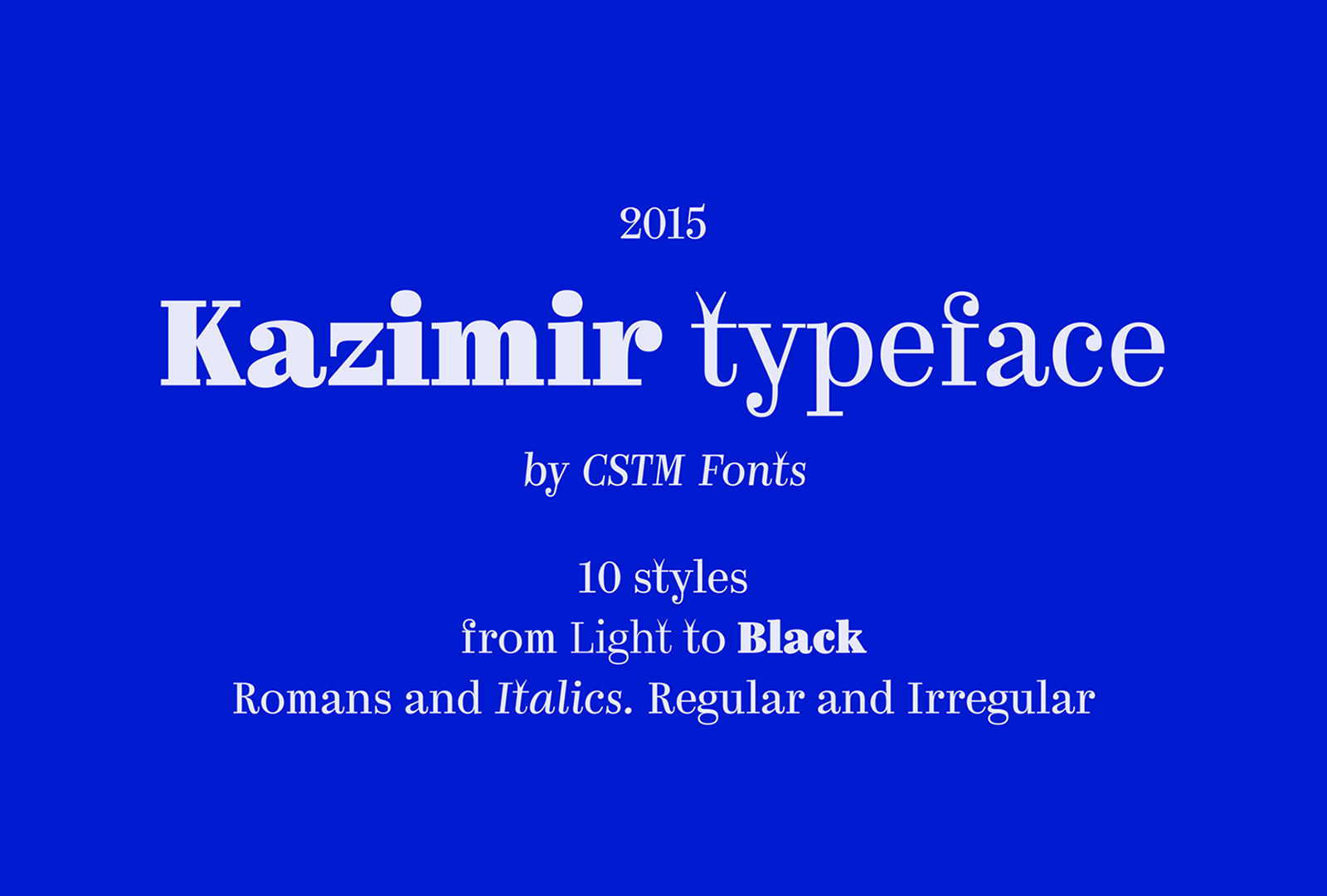
There was also a group of typefaces with a specific historical prototype: Signal’s design is based on the French Caractère, Kazimir is inspired by the typeface used in the old book History of Russian Literature.
 Signal typeface
 Caractère typeface
 Kazimir typeface
 “History of Russian Literature”, 1900
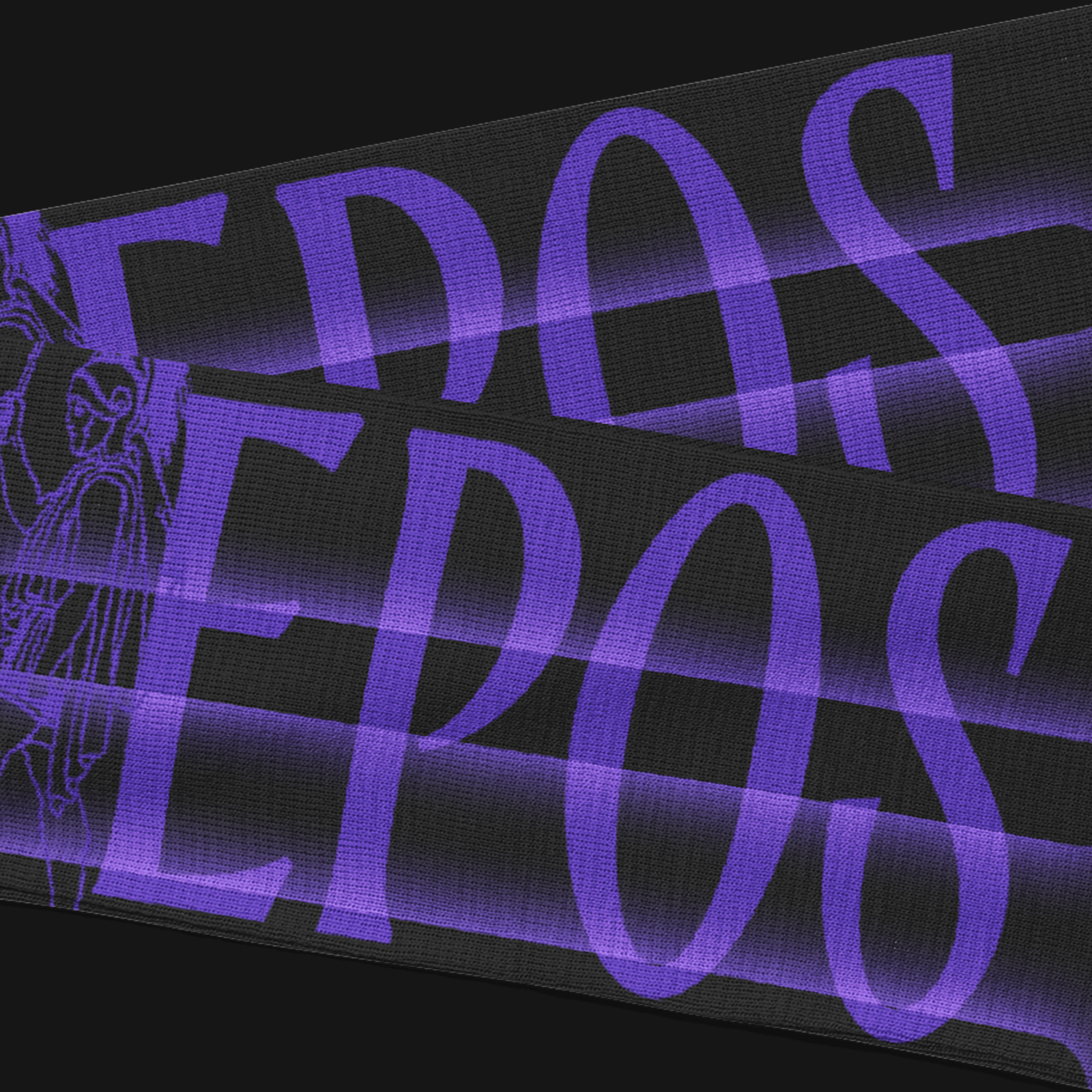
Then, there was a category called ‘Legacy’. Those are typefaces associated with a certain phenomena which is important for a certain culture or place. For instance, one of CSTM Xprmntl 03 styles is literally Cyrillic Ustav, while Epos started from the most popular Minsk-produced beer.
 CSTM Xprmntl 03 typeface
 Ustav (from “The ABC of Old Russian Writing”, 2008)
 Epos typeface
 Krinitsa beer packaging
And, finally, there were typefaces related to the city. I counted 12 of them and then found out that ESH Print had already designed a calendar utilising tomorrow’s fonts, last year, and got very
I introduced the descriptions of typefaces on a snap-out set under the calendar grid and tried to make graphics translate the relation of the typeface to the city. For example, Signal, which was designed based on French navigation signage, ended up on a road sign, while the dates on the calendar page using Cera Stencil look more like phone numbers on the pavement.


While I was trying to get the history of typefaces out of their plasticity and somehow connect it to the urban theme, I’ve grown used to them. All of them are distinctive, and yet so different. Before that, I worked only with CSTM Xprmntl 02 Italic, as far back as in my first


I particularly liked Curbe (which is in charge of March) — it comes in just one style, however equipped with four sets of alternates. Fud Grotesk as well, January. The first page I came up with was the one using Halvar Stencil — that is a stencil typeface, and the solution was rather obvious. But I just couldn’t come up with a Norbert page up until the last


