
Daria Yarzhambek: Hello, Sasha! Today we’re running an experiment — this interview will involve three people. Alexey Murashko happened to know that we were going to talk, and he has questions for you. I have taken the liberty to invite Alexey with me, if you don’t mind…
Alexander Slobzheninov: Sure thing. Hello, Alexey!
Alexey Murashko: Good afternoon.
DYa: Sasha, you come from Siberia, and now live in the Czech Republic. Please, tell us how you ended up so far from home.
AS: I’m from Tomsk. After graduating from school and college, I decided to do graphic design. As it turned out, the Czech Republic was a country where you could go and get an education. I studied at the University of West Bohemia in Pilsen, and now I live in Prague.
DYa: How did it happen that you decided to become a graphic designer?
AS: I come from a regular Siberian family and had not heard the word ‘design’ up until high school, yet I was always interested in letters: for example, I tried to copy the lettering from video games discs. One day, in high school, I found out that design existed after
DYa: Could you tell us about Pilsen?
AS: It is an industrial city, the fourth most populous city of the Czech Republic, yet it is basically quite small. And they have a quite good university with the Ladislav Sutnar Faculty of Design and
DYa: And what about type?
AS: That, we didn’t have. We had a typography course where I was taught to make up text into pages, for which I am thankful to our teacher, Pavel Švejda. We also had logo design, branding, all sorts of layouts and


Alex’ student works
DYa: How did you start doing type design?
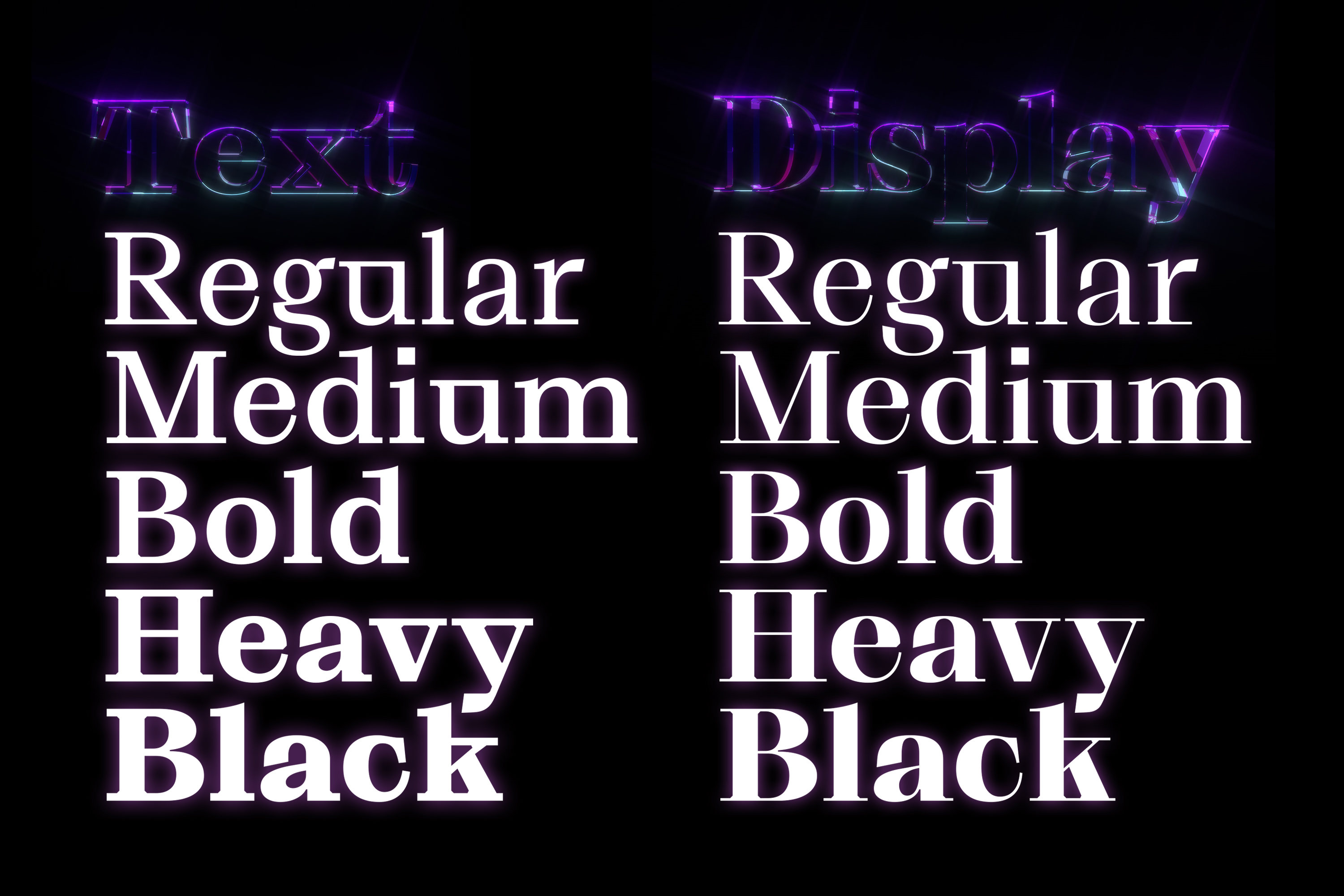
AS: When I began doing typography, I started to feel the need to have typefaces. As I soon found out, there are not so many free fonts, and regular buying new ones is expensive for a student. So I decided to find out whether I was able to design at least an alphabet. It took me six months to design my first


Fivo Sans


Fivo Sans Modern
DYa: And then wham — you become a designer with &Walsh studio and a type designer at Pangram Pangram. How did that happen?
AS: I came to Pangram Pangram in 2018 by the invitation of Mathieu Dejardins — he just saw my typefaces (that I was giving away for free at the moment), saw a certain commercial value in those, and invited me to the studio as a collaborator. Since then I have been releasing typefaces with him. Even though now the studio has other collaborators besides me, I still continue to work directly with Mathieu. As for &Walsh, that happened like this: after finishing my studies at the university, I made a list of studios where I would like to work, and Pentagram and Sagmeister & Walsh were at the top of the list. I sent them emails, and, to my surprise, both said yes. I came to Sagmeister & Walsh and immediately, while still an intern, started doing rebranding of the studio: Stefan left to do uncommercial projects, while we began drawing ampersands for Jessica’s new studio. Then I was promoted to a designer position and started doing design in a broad sense of the word: typefaces, typography, motion, even some mockups for photo shoots. A year later I realised that I had accumulated lots of ideas for certain projects of my own, mostly type ones, and decided to leave the studio.
 One of &Walsh studio logos
 ADC Annual Awards logo

 Typeface for Plenty farming company
 TED Countdown campaign logo
DYa: That is, you’re currently only engaged with Pangram Pangram and busy with doing your own projects?
AS: Right.

 Right Gothic by Pangram Pangram
DYa: Now it is starting to make more sense how you could have survived designing a typeface a day for 36 days in a row… And yet still not very clear…
AM: Alexander, how many kilos have you lost during these 36 days?
AS: 36. (chuckles). The hardest part of the #36daysoftype project was to make myself work full time. As a type designer, I have a flexible schedule that calls for self-indulgence. Yet in this project, I had to wake up and start figuring out a new idea every day.
AM: What were you driven by? Was it testing your skills, willing to increase your Instagram audience, or a personal challenge of some sort?
AS: Everything very conveniently came together in this project. I wanted to see whether I was able to design one typeface per day, coming up with more or less original ideas every day. Because it is possible to design a regular sans serif in a short time, but it will be the same thing every day, while doing every day something


From the #36daysoftype project
DYa: How was it? Have you been able to guess?
AS: In some cases I guessed right, while in other cases I felt bad about the fact that my idea wasn’t loved, and in certain cases it was the other way

From the #36daysoftype project
DYa: Do you have any further plans on these solutions? Will you somehow rely on the conclusions that you made about the response of the audience?
AS: I think I will. Another reason why I embarked on this project was that I really wanted to design a bunch of preliminary works that can be later completed and turned into full-fledged typefaces. Clearly, that is not a one-day task.
AM: You once said that if you were to give some advice to yourself when you were younger, you would recommend focusing only on important things, and brushing aside everything unimportant. While here you were constantly generating a finished type idea with a case in a short span
AS: I had to figure out a new idea every day, and I couldn’t start from whether it would be liked
AM: Well then I have a question about the efficiency of efforts on a longer distance: have any of your typefaces disappointed you in terms of relevance? It is not a question about money, but about the size of your expectations before the release.
AS: I have designed not so many typefaces, just four or five families. Half of those, let’s say, sells not that well. But the other half pays them off.
AM: Let’s look at the question from a positive
AS: I can totally say that sans serifs sell best — and it’s what you’d expect, actually. If you design a certain different serif, it will probably sell better. That is what happens in other studios, too: everyone designs sans


DYa: Do you somehow feel bad about the fact that people don’t need anything besides sans serifs?
AS: I am not interested in sitting and designing only sans serifs, which is why if I like a certain idea very much, I will complete it anyway, even knowing that it probably will not be commercially successful. And since sans serifs continue to feed me, it’s possible for me to do something uncommercial.
DYa: Since you have a solid background as a graphic designer, you can perceive a typeface not only from the point of view of an author, but also as a consumer. Do you benefit from this somehow?
AS: Only in the shallowest context — like adjusting typeface metrics so that the lines won’t stick. While from the perspective of its future use — such as, ‘this one is a branding typeface’, — I can’t guess things like that. Therefore I simply do what I find interesting from a type
AM: Yet in your interview to It’s Nice That you were saying that most of the typographic tasks have already been solved, all the typefaces designed, which is why type designers have room for art. I was planning to learn more about this concept…
AS: Actually, my views change over time. I wouldn’t perhaps say that today simply, because art differs from
AM: And don’t you think that Instagram posts — both yours and by certain other young type
AS: Yes, but a post — it’s not a typeface anymore, but a poster with a typeface. And those posters do have
AM: Isn’t it too much of your effort to waste on such an image?
AS: It pays off, if it eventually gives you a job and brings money. In case of type foundries, it makes them
DYa: Alexey, what is a criterion of usefulness for you?
AM: In the first place, it is a possibility to use, and not just enjoy the visual result. Because often type designers post very unexpected graphic or plastic experiments that you can’t apply, because there are only two or three letters, and you can’t borrow their
AS: I do, I have the Contemporary Type account where I post things which I find interesting from a professional point of view. I try not to post something that gets many likes in other accounts but, in my view, is not very original. Many of my posts are the typefaces that can be purchased via the link. But, clearly, not all
AM: I noticed the list of typefaces and type heroes that you particularly respect and find particularly interesting. Many of those are marked by a certain perseverance and slowness that bring incredible


Secret Life book. Set in Signifier, Garalda, Brioni Sans. Designed by Alexey Murashko
AS: It is not that I reject them, it’s rather that I don’t find them. I generally try not to design typefaces which are based on an interesting graphic idea but are not very usable. My commercial fonts are quite regular…
AM: But I don’t see it this way! Many of your typefaces are things-in-itself that provide an amazing experience, when you feel the need to find a project based on them, and not vice versa.
AS: What typefaces would that be?
AM: It was an incredible challenge to find a relevant project for serif Relaate. And I got so carried away with your plastic idea, that in order to put the typeface together with some other elements, I had to come up with a graphic solution that eventually was key for the book’s project. This book was awarded the Latvian National Book Design Award. Much of the credit goes to you: when people see the sunflower petals next to peculiar letterforms of Relaate, they find this combination so eurythmic, that they have no questions regarding the sharpness and excessive pretentiousness of this typeface…


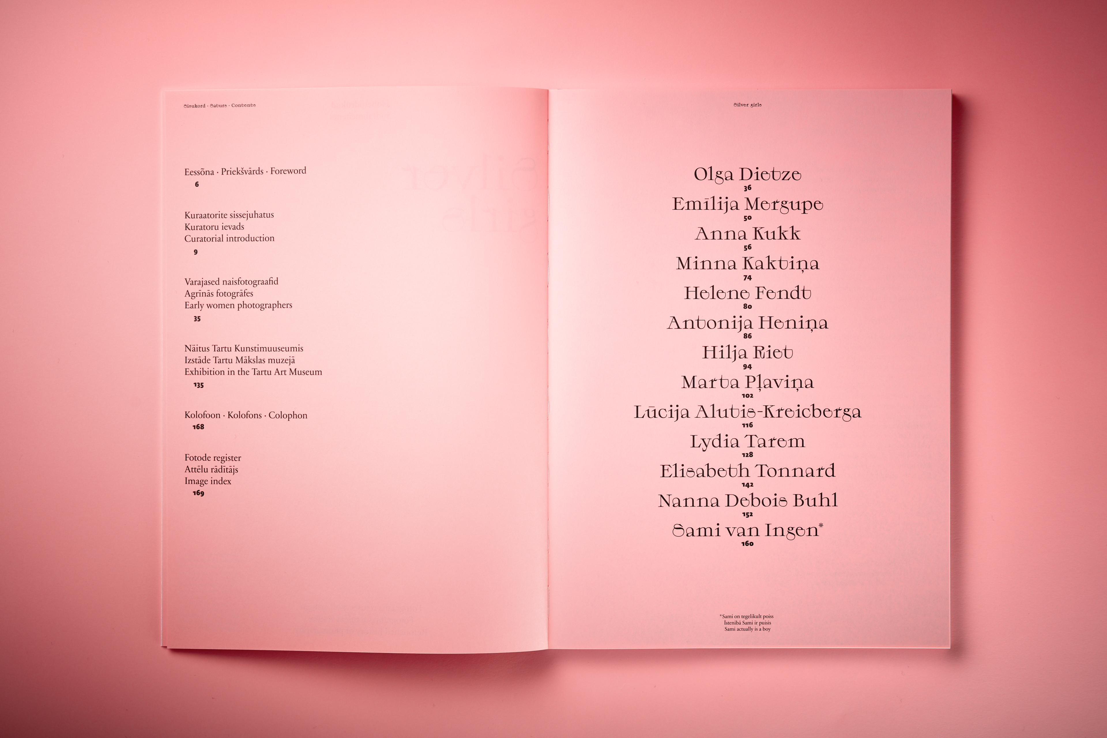


Silver Girls book and exhibition. Set in Relaate, LT Sabon Next Pro, abc Allegra. Designed by Alexey Murashko
AS: I agree about Relaate: it is weird and most likely inconvenient. However the rest of my typefaces are regular, or at least not that wild. Grafier is perhaps a bit bizarre as well, but it has stylistic alternates that unhook connected serifs so that it becomes rather regular.


Guide on Cyrillic typography for graphic designers. Set in Grafier and Neue Haas Unica. Designed by Yana Vekshyna
AM: Have you ever thought about the future life of your typefaces? Such powerful and expressive typefaces as Relaate or Grafier can have this kind of success just one time. Given this success, I can hardly imagine applying it again any time soon. Yet you continue to work on its new styles, glyph set and kerning, even though for me this rifle has already fired. Don’t you feel bad?


AS: That is a rather well-known fact that display typefaces have a bright and short life, while boring typefaces have a long and happy life, albeit not that visible one. The very same Helvetica, sorry to mention it, stills lives and seems to have no intention to die out. But when Relaate got more styles, people started buying it more. Currently, it is available in such a format that it has everything a commercial font should
DYa: Grafier sells on type.today’s platform, and you, Alexey, have gotten to know it a little bit. Can you tell us how it felt?
AM: Alexander has already mentioned that the typeface is equipped with OpenType features that make it somewhat more normal. But, probably because of the willingness to showcase these brightest qualities of Grafier, all Instagram posts accompanying its release, and even its default set on the website, have in no way suggested that there actually was a more regular, unhooked version as well. I chose Grafier precisely because of its deliberate brazen personality and used it in a size that implied no questions of readability. Which is why I am a bit ashamed that I haven’t even thought about checking Glyphs palette and discovering another character set with different letterforms. But, unlike Relaate, which ended up in the zone of aesthetic tension in my mind, Grafier didn’t happen to mean that much for


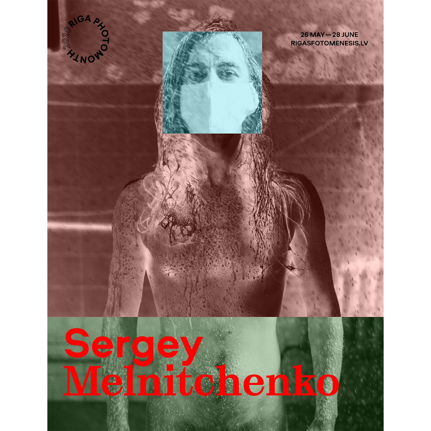
Riga Photomonth festival. Set in Grafier and Aeroport. Designed by Alexey Murashko
Actually, type.today became for me the same location as Fontstand, but Cyrillic-wise. Every time I need typefaces supporting Cyrillic and I don’t have much time for searching, I will most likely go to type.today and choose something that I have probably seen somewhere, but didn’t remember for some reason. That is a real tool which helps save a lot of time, but only when it comes to Cyrillic.
DYa: That is great if it is. Sasha, you seem to design Cyrillic not so often?
AS: Not often, yes.
DYa: Why?
AS: I am making an effort to formulate an answer which would be as politically correct as possible…
AM: Gayaneh Bagdasaryan once explicitly wrote that Brownfox design Cyrillic
AS: Yes, for me, designing Cyrillic is volunteer, unpaid work. And I always face


Le Murmure Cyrillic
AM: For you, the standard is extended Latin?
AS: Yes, my standard package is European languages. I had never designed the Icelandic letter ð, because I believed that no one from Iceland would ever use my fonts. But as soon as I released another typeface without this character, I was contacted from the Faroe Islands with a request to add it. And I did. After all, introducing one new character is not the same thing as designing the entire Cyrillic alphabet and kerning it with punctuation, letters, figures, and so on.
DYa: Do you design Cyrillic upon one request or do you accumulate requests until you realise that it is commercially viable?
AS: Sometimes I design it because someone is ready to purchase a good license and pay for it.
AM: Do you have any help?
AS: I need to have some people to help me, but I don’t have them yet, because I have a problem with seeing where design ends and production starts. I am actually more interested in production
AM: You live in the same city, is that right?
AS: Yes, we’ve known each other for a long time. We met when we came to take language courses. He also studied design, at another university, also does great design and great typefaces, and also sells on tomorrow’s storefront. He makes a quality


Right Grotesk. Cyrillic by Ilya Bazhanov
AM: Haven’t you considered the possibility of launching your own type label?
AS: It’s one thing to design type, and it’s quite another to launch a store, work on a website, do sales, and communicate with clients whom you need to explain how to activate OpenType features. Many of those who launch their own foundries stop designing typefaces and do mostly creative direction. For now I prefer to delegate those things to someone who will sell my product.
DYa: What’s your take on Pangram Pangram licensing policy?
AS: I know nothing about it. My role is to submit typefaces to them, that’s it.
DYa: They have an absolutely blissful thing going on in terms of trial versions…
AS: A few years ago I had a conversation on the subject with Mathieu. As I see it, the idea is that we focus on those who are willing to buy fonts, and we do everything to make them as comfortable
DYa: Do you follow any designers in the Czech Republic, or are you a man of the world in this sense?
AS: I am a citizen of the
DYa: What about Russia?
AS: I don’t know a lot of people in Russia, though I try to follow the posts of Timur Zima, read type.today and all that. But for some reason, designers from Russia pop up on my radar less often than, let’s say, the very same Germans, or people living in Germany (because half of them are not Germans). And the French as well! The French are everywhere.
DYa: Is there any division into national type schools left, what do you think?
AS: I have recently run a workshop for young designers in France. I got used
DYa: Could you somehow define the present
AS: I believe, it all boils down to two points about what we didn’t have before, what reflects the present and defines the development in the future. The
DYa: What do you think of variable font technology?
AS: I am all for it. I know that many people are against
DYa: Why are there so many troubles with delivery to the user? As if nobody particularly needs this technology which is many years old.
AS: As any other technology, nobody needs it until someone does something interesting with it, and everybody will want to do the same.
DYa: Do you have an ambition of doing something, one day, that will not answer the need but will change the current state of affairs in type?
AS: I have a very ambitious project: a tool to design styles for me. If I manage to make something good out of it, it will be a certain breakthrough.
DYa: And in terms of graphics?
AS: That would be nice, but it’s difficult. There is no recipe for how to do it. In type, there are recipes for many
DYa: Many people say that when you’re creating a typeface, you can’t guess what will
AS: I think we have both things here. In some cases, we just reproduce a clear pattern. But sometimes there is a chance that interferes, or there is an idea that emerges that drives you away from this beaten path. I have this
AM: Do you have a professional dream?
AS: No, I don’t have any high dreams, only goals to be achieved in the near future.
AM: Can you share with us if you don’t mind me asking?
AS: I am truly interested in learning to design the kind of typefaces you were talking
Alex Slobzheninov
tomorrow.type.today/en/designer/slobzheninov
instagram.com/slobzheninov
behance.net/slobzheninov