
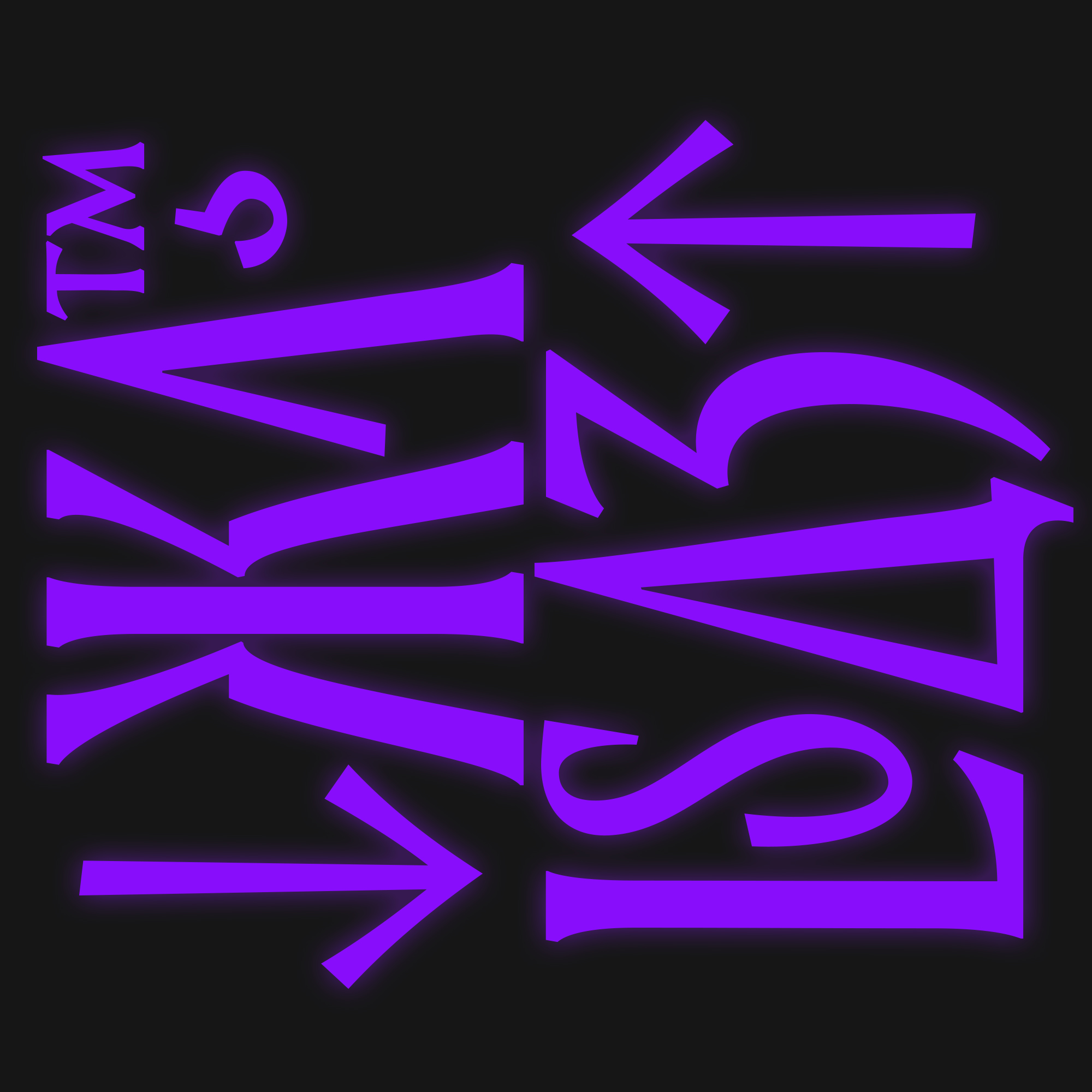
Rethinking of hand-lettered titles based on Latin monumental writing in three widths
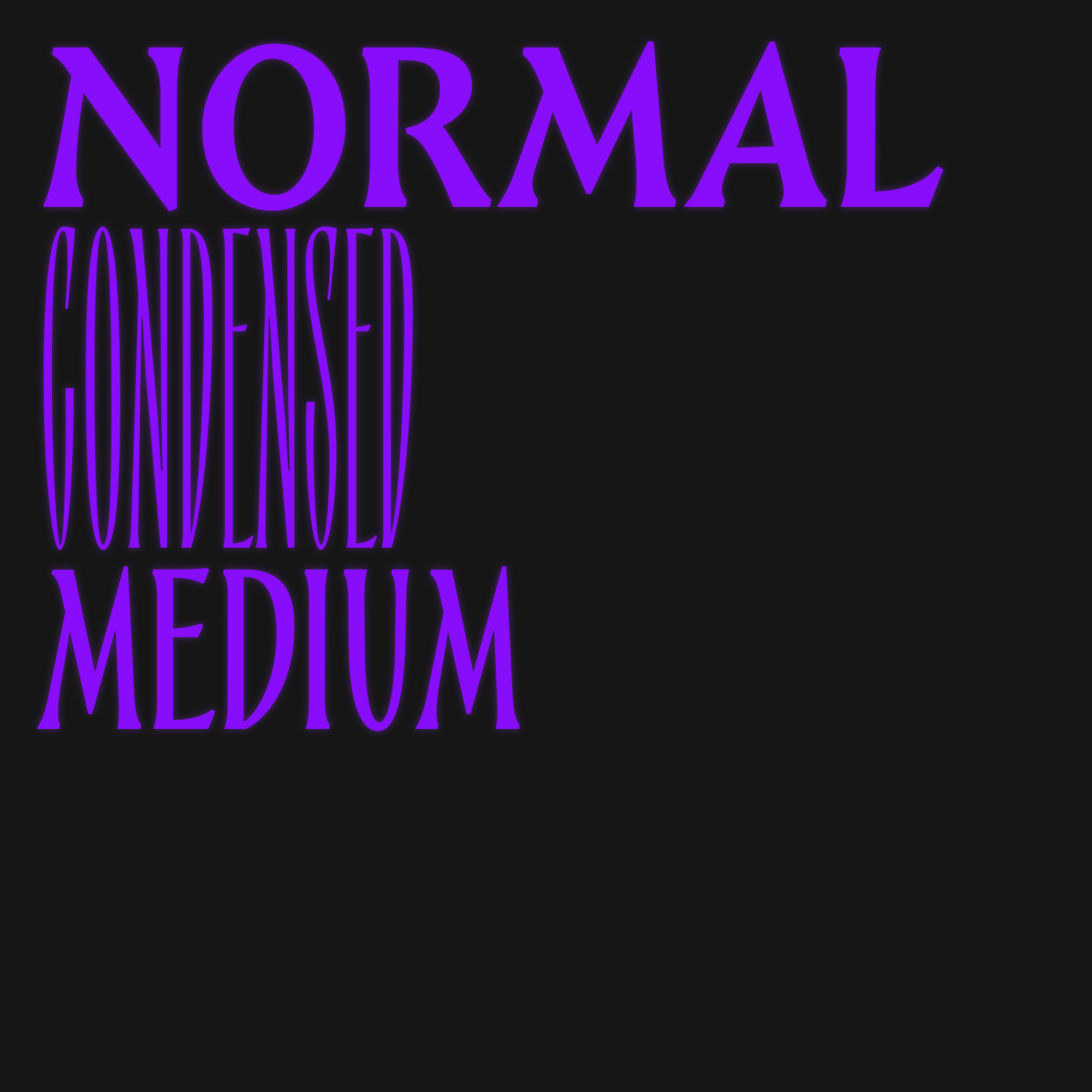
Hand-drawn headline fonts with ancestry in Roman monumental typefaces became the source of inspiration for the Epos font. Epos originated from the ”Legends of Mensk” project. It was a limited beer collection, which required a unique lettering solution. This origin story explains the national identity of the typeface, omnipresent yet hard to pin down. Latin script comes from the Cyrillic alphabet. It is a peculiar reversal of a more traditional approach to font production. There are three styles of different proportions and weight: Normal, Medium, and Condensed. The font consists of capitals with the necessary ligatures. There are also alternative solutions for advanced use. The font was released in 2018.


Author
Denis Serebryakov is a font and graphic designer working in Minsk. His interest in type design stems from the development of logotypes: every logo greatly affected the look of fonts, all being display. He released the first retail typeface in 2011. Among his typefaces are Appetite Pro, Bouquet, Canapa, Displace 2.0, Epos, Rozza, and others.