
The Non-Central Moscow
Victoria Makeëva
fourth-year student, HSE Art and Design School, Moscow
The book is a part of my graduation project. In this book, I am exploring the non-central Moscow: what it is made of, what defines its life. Let’s just say that there is a city center, that there are certain rules, a certain idea of how it all works, what it should be like. And then there is a Non-Center: how it all looks in real life, living in violation of those rules – or vice versa, in strict compliance to those rules, in an exaggerated manner. So it turns out to be either naïve or weird.
Initially, my project reference board featured various experimental, funny fonts; I had an idea of what image I wanted to come with eventually, and I was looking for a perfect match. Xprmntl 02 was suggested by my tutors, Xenia Ermakova and Elizaveta Kopay-Gora: they put it into my layout, and that was it! In this family, you’ve got three different fonts living under the same roof, and when you look outside, you see the same – many different things colliding with each other. The beauty is born in this contrast of otherness.


It immediately became clear that the traditional, careful approach to the type process was no good here. I had an idea: what if I go rogue? What if I use a display font in the footer? What if I make captions five time larger than the body itself (and page numbers – ten times larger)? And locate the contents list on the title page – plus, in a way that you don’t get to read it easily? Before Xprmntl 02, the layout just didn’t quite work out, but once the fonts were introduced, it was like they themselves were begging us to do all sorts of crazy things.
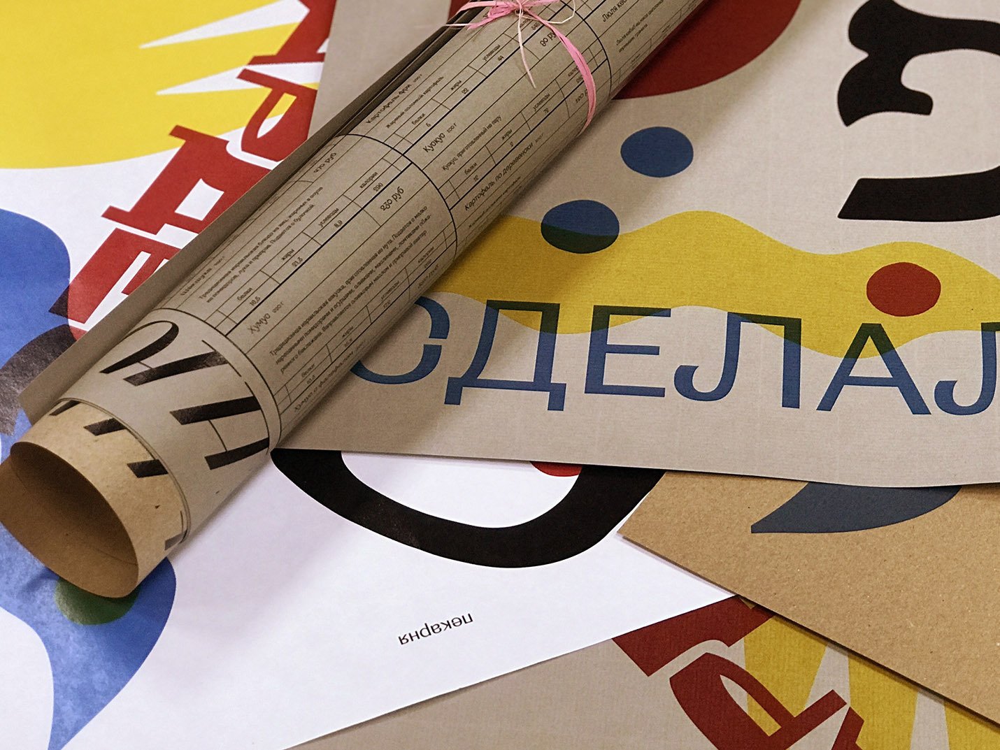
Menu and labels for Pardes
Alexander Lartsev
graphic designer, art director, senior lecturer at HSE Art and Design School, Moscow
Pardes is a kosher grocery shop in Maryina Roshcha neighborhood in Moscow, with a milk-bar and a grill (recently the place has been awarded a diploma for best falafel by Time-Out magazine, you should stop by and check it out for yourself!) For the shop’s owners, it is not so much the business as it is a dedication to the kosher cause: the guys call the place their Art Project. I’ve been here for them since the very beginning, and for me it’s like some kind of a testing ground for experimenting with typography, branding, packaging. All I had to do is to make them go in for the experiment. I guess you could say that with those guys I haven’t had any usual problems that you normally have when dealing with a customer.
Having ran onto Xprmntl 02, I felt truly inspired by the idea that you could put together fonts into a family basing not on the similarity of glyphs, but rather on something else. I was eager to try all three fonts in one project. So, I suggested to draw up a menu for our grill bar and then use it as a tablecloth – and this menu is to have a poster on the back of it. I had a hard time to fit it all into a table, so finally we came up with a window where we would add some new info, or topic-based mini posters typed with the very same Xprmntl 02, with the use of a printer.

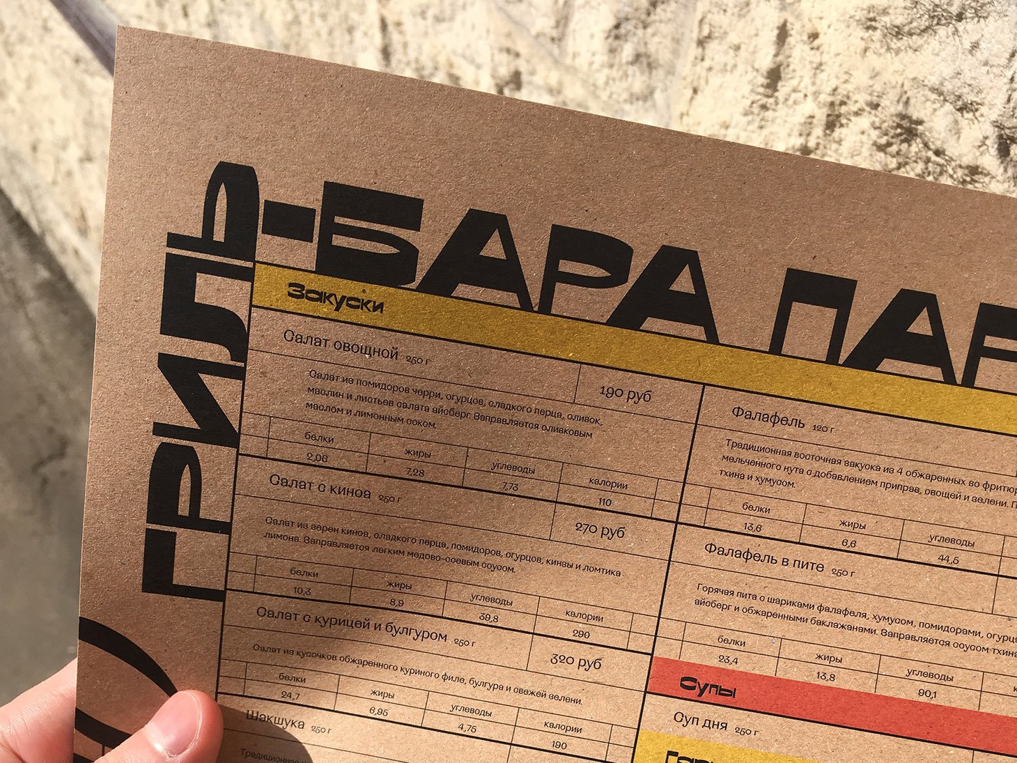


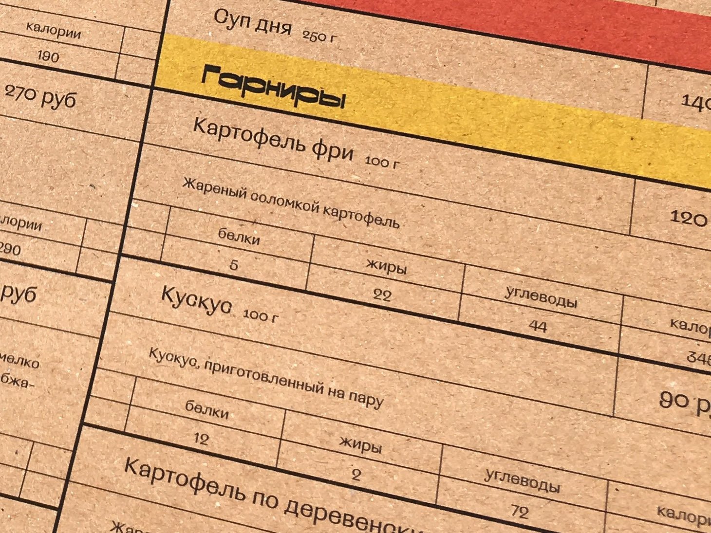
As it went on, it got even scarier. When it came time to design new labels for products on the shelves of our store, we started to have more doubts. For example, in the Regular we have some tricky shapes of С and З – which becomes especially important when you set the 4.5pt font size. But it turns out that, with the poor quality of printing (96 dpi), all subtle details just vanish away; the font is way better readable in low resolution than in high resolution.
Still, we had a hard time with Bold: it has narrow apertures, and the shapes start to fuse, to become indistinct – so that 9, for example, starts to look like 8. It seems like we have to make larger figures. Although, it was good enough for the guys at the store: ‘Perhaps, it’s better that you can’t see how many calories are in those cookies!’

The fonts really go well together, creating a nice design. Plus, since the Bold is really active in horizontal dimension, it resembles the Hebrew, – in which, unlike Latin or Cyrillic script, the horizontal stroke is the active one. And this all looks pretty great with the label barcode. That’s a contrast!
It was interesting to see how the font would behave under extreme printing conditions. The font seems to be aimed at provoking debates: what is readable, and what isn’t. Who ever would have applied it to price tags? That’s a good thing that I have an opportunity to pull off this trick. The result is rather interesting, and I like the idea of being able to challenge the usual idea of typeface legibility.
What the author thinks
Yury Ostromentsky
It is very nice to see a font used the exact way you intended it to be. That is very rare for: normally, once you finalize and release a font, it is no longer yours – you don’t own it anymore. Prepare yourself to see it being used in every possible way – and get ready for the fact that you won’t like most of those ways, for one reason or another. Whereas in this case everything works just the way you’d planned.