
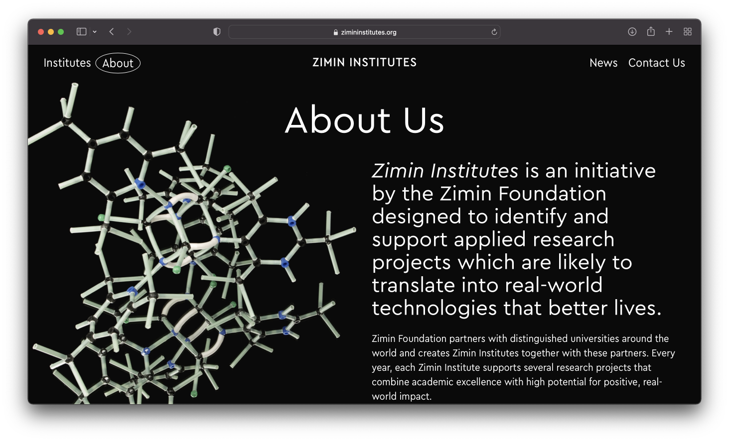
Zimin Institutes is a non-profit initiative founded by Russian entrepreneur and philanthropist Dmitry Zimin (1933-2021). It includes three research institutes at one American and two Israeli universities that support applied research projects on urban studies, medicine, renewable energy, brain sciences and many other areas.
The website of Zimin Institutes designed by Sulliwan Studio is set in Cera and Cera Compact. Regular width is used for the titles, subtitles and factoids, while the texts that tend to appreciate more space — such as paragraphs, captions and less important titles — are set in the narrowed option.
Certain text parts are highlighted in italics of one or the other typeface.


The use of a geometric sans serif font was somewhat predetermined by the site’s austere, disciplined background (black-and-white, lines, ellipses and rounded angles) — yet Cera sounds much clearer and friendlier than its other colleagues of this genre would sound in such a strict environment. It’s all about the details such as a two-piece а and small descenders (but the ascenders are still quite tall).
The other reason is Cera’s shared stylistic solutions: the glyphs are similarly spaced and keep a decent distance from each other — this makes the set sound modern as well as makes it a good geometric-font choice for as long and small texts as you like.


Cera Compact has the same qualities as a regular typeface, however it can embrace more text in the same space — which is especially important when it comes to smartphone screens.
Besides, the narrowed font shows another kind of charm when set in all caps with little spacing — it appears strict and tall.


Cera was designed in 2015 by Jakob Runge (TypeMates). Ilya Ruderman and Yury Ostromentsky (CSTM Fonts) were in charge of Cyrillic improvement. Cera is a geometric grotesque with precise yet interesting shapes and generous spacing — a great fit for screen typography (but not only that). Also boasts italics with the structures of its own.
Over the years, Cera family welcomed a number of new members: Cera Round, Cera Stencil, Cera Compact, and Cera Condensed.