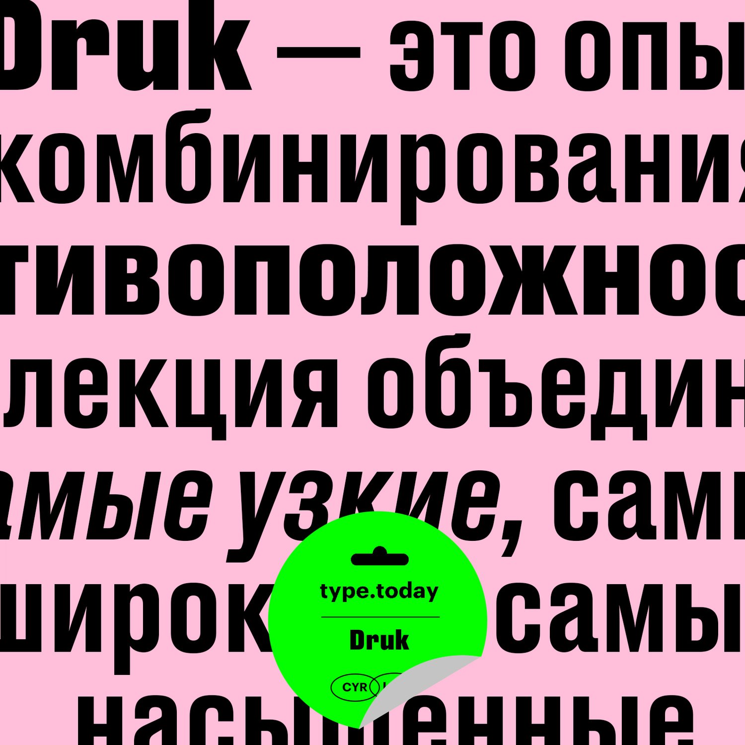
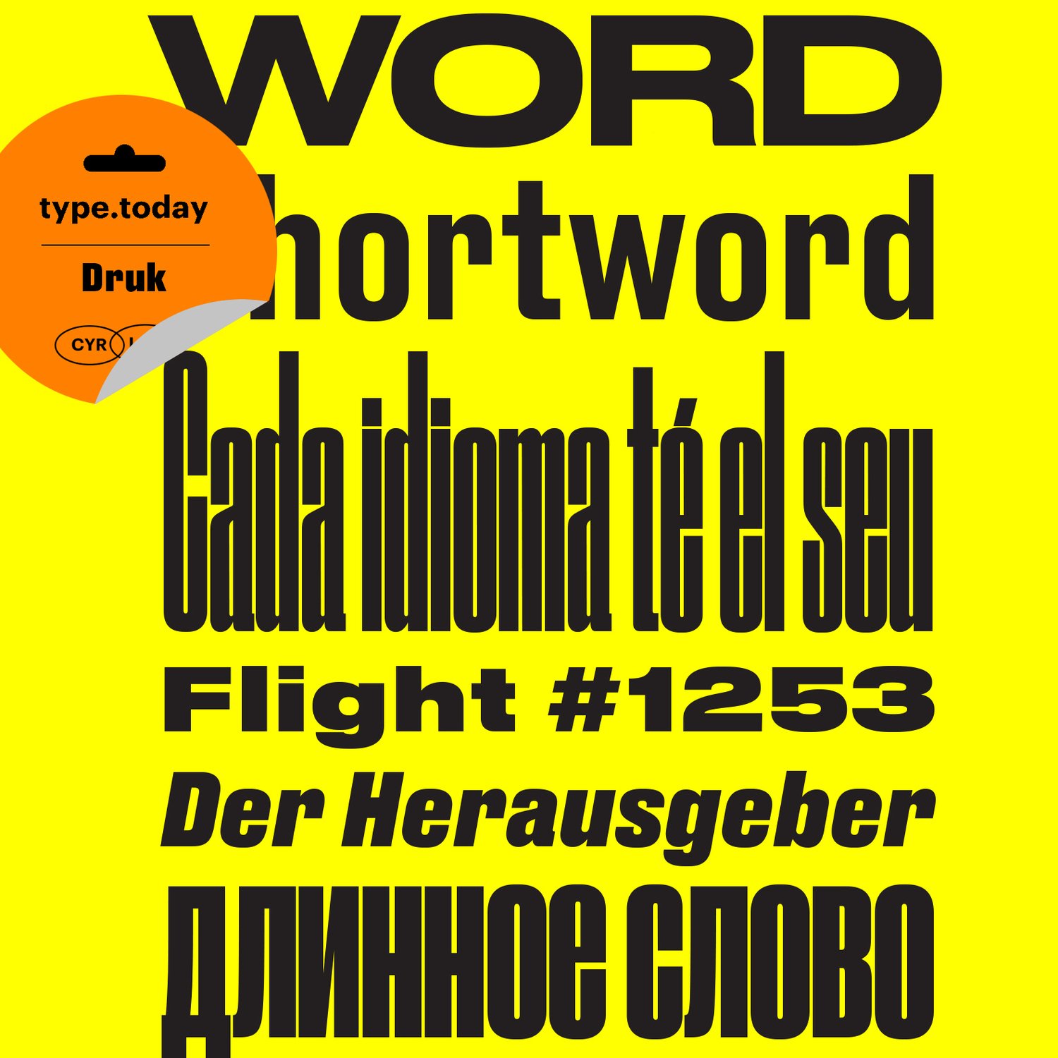
Druk was consciously designed without a normal width, nor lighter than medium weights. Berton Hasebe, the designer, wanted to avoid the compromises of forcing the typeface away from its essence for more general-purpose usage. Druk is conceived to offer new possibilities to graphic designers that other typefaces can’t. Its initial use as a companion to Neue Haas Grotesk demonstrates that it works equally well with any number of other sans serifs, including Atlas, Graphik and Marr Sans. Its three widths can be mixed together for bold and expressive typographic treatments, and its text versions allow for use at very small sizes, giving structure and visual interest to typography at all scales.
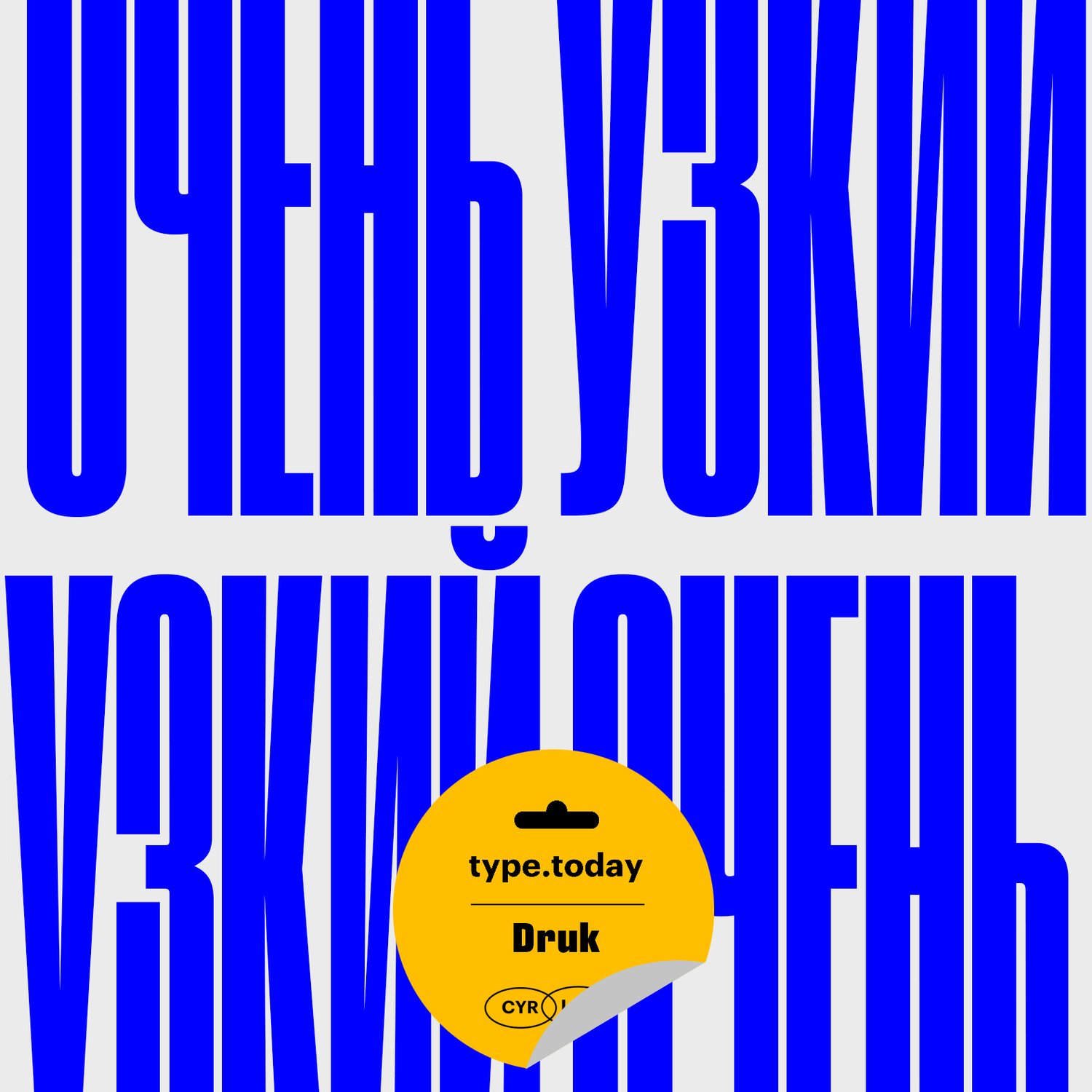
The sans serif letterform of the 19th century evolved in many different ways by the end of the century. The first condensed forms, found in the 1830s in Britain, quickly spread all across Europe. Some of the most interesting examples were found in Germany and Switzerland.
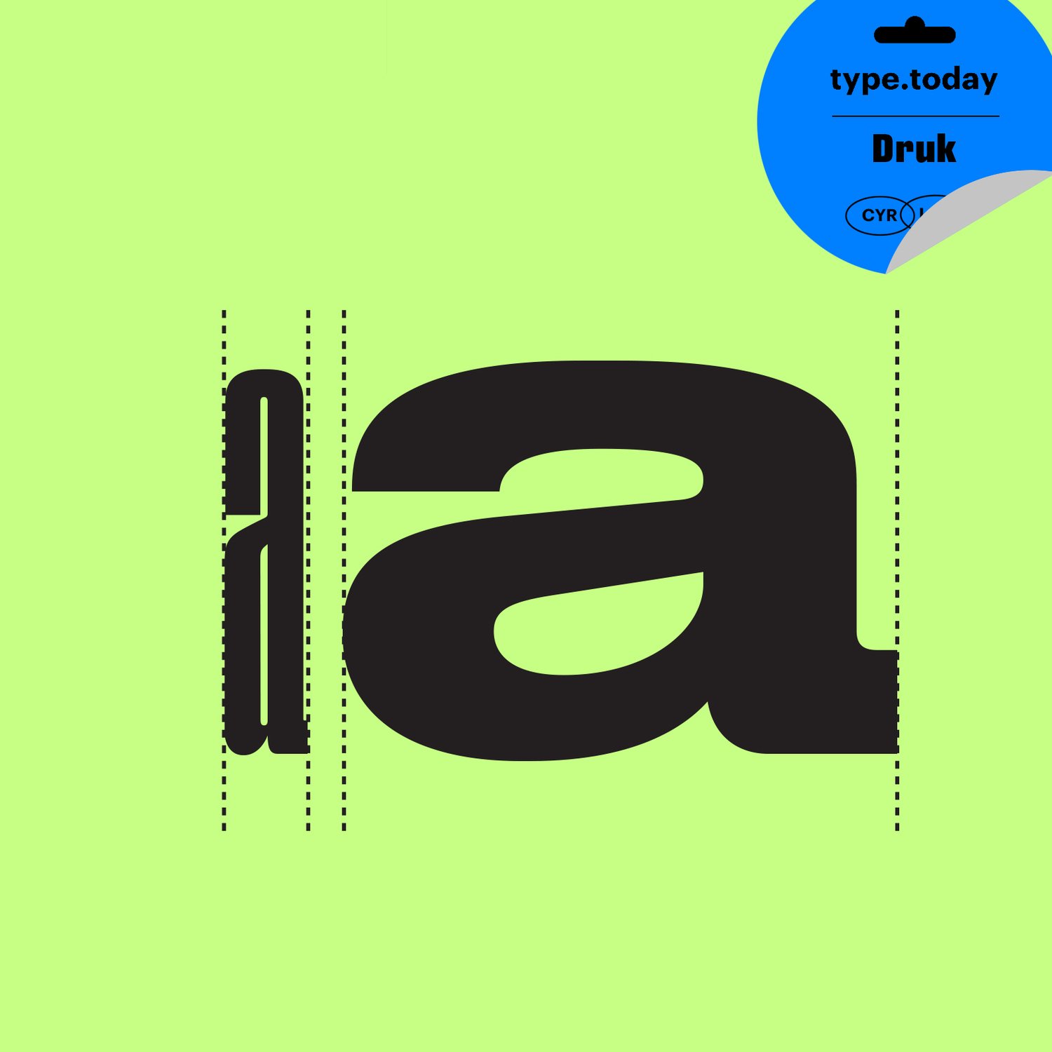
Often flat-sided, these Continental condensed sans serifs allow very tight setting, which was popular for headlines. These later became a staple of sixties headline typography in magazines such as Twen, the German style magazine art directed by the legendary Willy Fleckhaus in the 1960s, which is still an enduring influence on editorial design to this day. Berton Hasebe created Druk Cyrillic for Richard Turley at Bloomberg Businessweek, adapting the attitude and roughness of these old condensed sans serifs for contemporary use. After using a staple diet of Neue Haas Grotesk and Publico for two years, they wanted to add a typeface that would look both exciting and distinctive in and of itself. The result was Druk Cyrillic, which went on to play a major role in many of their iconic covers.