
I know — from everything that you do — that you have a very flexible, but a very emotional understanding of typography. How the typography correlates with images, messages, everything. Do you have any explanation of your perspective and how it came about?
I sure do. In general, from very early on in the studio we aimed to touch somebody’s heart with design. It came out of a frustration with how so much of professional design left me cold. When I looked at the reason why it left me cold, it was because it tried.
Specifically, in the ‘90s, there was a resurrection of mid-century modernism — all the logos were very exact, very clear, it was all very geometric. All designs tried very hard to be machine-like, almost as if it was made by a machine, which I found ridiculous — considering this was an 80-year-old idea at the moment. It came about when the machines were actually new, and the Machine Age was a bulwark against the 19th century. There was a desire for typography to look like it was clearly made by a human being — hence all the photography type and all the handmade type.
We’re not talking about just handwritten type, but letters clearly made for this specific project. The main idea was to merge image and typography into one, to make the sentence and the imagery telling the same, communicate the same message.

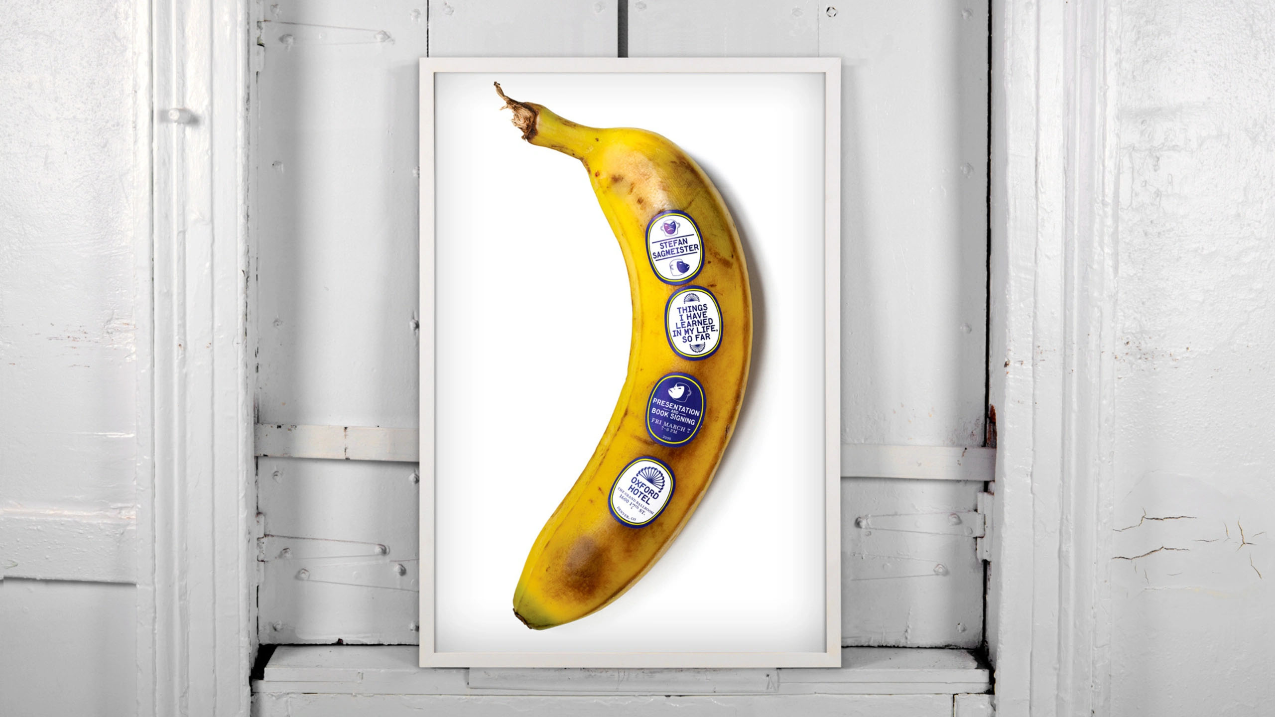


Posters by Stefan Sagmeister
We’ve designed very few typefaces ourselves, most of the time we commissioned typefaces. I don’t think that we were on the forefront of what it means to be a type designer, not at all. We haven’t ever made one of our typefaces available commercially. It just was not in our DNA.
Did you have an experience of working with Cyrillic?
I had slight experiences in situations such as that of the Beauty book — a grown person discussing with me, literally for hours, ways to represent the word Sagmeister in Cyrillic, which was endlessly fascinating. I remembered reading some essays about Nabokov, who always talked about how Russian is much more of an intricate and mistake-free, exact language than English is. I know that Nabokov regarded all his books written in English as second class. He said that Nabokov should be read in Russian, if one really wants to understand him. Considering that his books in English were pretty damn good, I can only imagine what that actually meant.
I, myself, never did anything in Cyrillic. Even though I did, for example, extensive pieces in Chinese when I lived in Hong Kong. I was very positively surprised that when our book was translated into Russian, they went through the trouble of designing Cyrillics for our typeface — which I truly appreciate. That’s a very work-intensive step to go through — more so, for a book that was printed some 5,000 copies.
 Beauty, creative direction by Jessica Walsh and Stefan Sagmeister. Phaidon Press, 2018
 «Загмайстер и Уолш о красоте», art direction by Maria Krasovskaya, type design by Natalya Toropitsyna. MIF publishing house, 2019
 «Заґмайстер і Волш. Краса», designed by Mykola Kovalchuk, Daria Matzola, type design by Dmytro Rastvortsev. ArtHuss publishing house, Kyiv, 2020
We used to look on type as something very static, a fixed form. Now there is variability, there is animation, there are loads of ways to manipulate the shape and control its movements. Has it changed the way you work? What do you think about variable fonts in general?
I think it’s a logical development. Like all formal developments in design, they’re driven by technology. If you designed a logo in the ’80s or ’70s, you wanted a static mark that would look exactly the same everywhere. This, of course, changed significantly, for a number of reasons. One being virtual technology — a screen is often the only way for a logo to be seen by many, many people, since no one sees letterheads or business cards anymore. The animated version of a logo almost became the main version.
On top of that, in branding, we found that this static repeatability has been over-emphasized. Sure, it’s important for many brands, such as Starbucks — who want to communicate that their latte tastes exactly the same in Timbuktu as it does in Moscow. For many other brands, who want to show flexibility or creativity, who want to show that they are adaptable, it would actually be a hindrance to have exactly the same logo everywhere. I think similar things happened in type design, firstly, thanks to the incredible importance of animation.
Do you have a default font, the one you start your every design with?
It changes over the years.
And now?
Now, probably, it is GT Sectra. I’ve used it quite a bit, it’s also in the presentation I’m doing tonight. It’s just that it sounds pretty and easy to use. For a long time, it was Replica, which had been the font for our studio before we switched to Spartan.
Do you have a favourite type foundry or a type designer?
There is an incredible amount of types being created. I’m quite sure we are living in the golden age of type. I would also assume there will be a point where this goes down again.


Live the Art, Deitch Projects book. Creative direction by Stefan Sagmeister, 2014


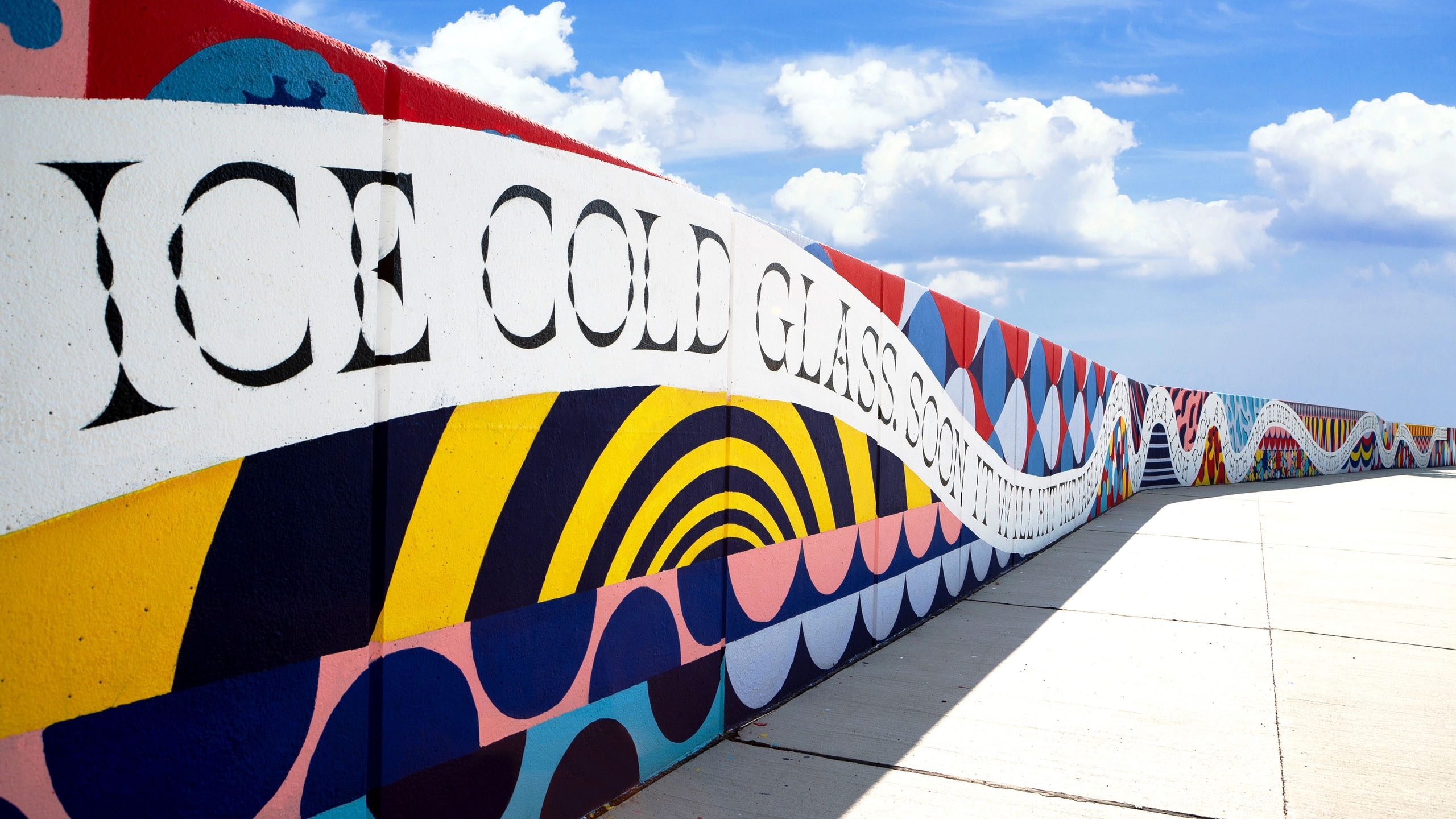
The Beutification mural in Asperner Seepark, Vienna. Creative direction by Jessica Walsh and Stefan Sagmeister, 2019
In the studio, while looking for a face for our clients, I basically would give a direction, but a very big direction — let’s say, ‘I think this could be a newish upright script, possibly bold’. We have one or two people who are really into the current typographic landscape, they would make a list of eight or ten types and a really delicate answer on how they prefer this over that — it all depends on how well the faces were designed, if there are kerning pairs and things like that. And then the decision is made. I, personally, don’t think I could give you a very valid informed answer on which foundries I prefer.
The reason I’m asking this, I’ve maintained quite a few work relationships with art directors and graphic designers, who often ask me to customise something, offer them some typeface, or advise them otherwise. On the one hand, this clearly benefits both sides — on the other hand, I’ve noticed I’m becoming a consultant rather than just a designer who produces fonts for sale. We became some sort of service.
It might be a boring answer, but I think I’ve had that sort of relationship with Jonathan Hoefler. He designed a typeface originating from old watches. When I had to design typography for a watch, it made sense to use this face, to, basically, recycle it.


Type 3X watch, Ressence x Stefan Sagmeister, 2021


The Happy Show, exhibition at the Institute of Contemporary Arts, Philadelphia. Creative direction by Stefan Sagmeister, 2012
I think that my inclination right now would go more towards very decorative typography. I’m using much more headline-y kind of things.
I know that for several years you’ve been reposting other people’s news and projects on your Instagram…
No, they’re sending it to me, I’m not reposting.
And quite a lot of them are designers from Russia and other post-Soviet countries. I wonder if you think Russian design is visible in Europe or the States? Do you see anything specific about it, some sort of approach or flavour? We know the term Swiss design, British design, do you see something specific maybe when it comes to Russian design?
Interesting question. One of the most interesting learnings from my Instagram is that the value of living in one of the cultural centres is clearly decreasing. Good designers come from anywhere and I don’t give any quotas, I don’t give a shit. I mention the place like they write it in their letter.
If you say there is a lot of work coming from Russia, or the Eastern Europe, I would say — from this overall world, and it is some very good work, which makes me very happy. Because I’ve been here 25 years ago — your scene seemed to be ruled by people of the age I am now. When I came back ten years later, it was mostly…
Young people.
Yes, but they mostly did bad copies of something American. A sort of terrible Coca-Cola imitation, adaptations, lots of Photoshop crap. The people who did the “quality posters and typography” seemed to be without a job.
Now, that completely reversed again, and now you have a lot of young people doing excellent works. Some of them, I’m sure, we’ll see tomorrow right here at this place. I’ve met a couple here, not from Russia, they are from Latvia, but they do a lot of work in Russia. They showed me some of the music videos they have just done in Russia — and it was amazing, very high-quality and huge production. They’re very young, I think he’s 30, she’s even younger.
Eleusis short film, directed by Andzej Gavriss, production design by Julija Fricsone Gavriss, 2021
There’s definitely a clear new voice — but if this voice is identifiable as Russian or non-Russian, I’m not sure yet. I’ve seen too little of it yet.
That kind of question is now quite a big one worldwide, not just in Russia. Basically, when you talk about Swiss design, you’re really talking about Swiss design from the mid-century, you’re talking about Müller-Brockmann or people from the ’50s, ’60s, maybe ’70s.
Yes, but at the same time, there are a lot of contemporary Swiss designers, like GrilliType, Dinamo, who are still very Swiss.
It’s true, you’re right, but I would argue that their design is a bit less easily definable as being Swiss. You and I know that it’s less Swiss than Müller-Brockmann is.


Posters by Joseph Müller-Brockmann, 1957–1960


Native Instruments x Dinamo, Maschine Mark 3 groovebox, 2021
I think that the whole question is super interesting, and I do believe that, ultimately, we are going to go back more into localities, even though I’m a big believer in the entire world becoming one. I think the globalization did a lot of good things, particularly for very poor people — and we see that in numbers. In the last 100 years, we went from 90% of humanity being extremely poor, to basically just under 9%. Now with this COVID the figure might go up to 10%, but still — from 90% to 10%, it is an amazing result.
The good outweighs the bad. One of the bad things, of course, is the sameness, that many cultures become invisible.
I hope there still would be a room left for cultural independence.
I think everyone does! I’ve never met a single person who is interested in the world being exactly the same everywhere.
Which is especially important for type design. I witness how Cyrillic market is growing, even as I look at the number of my commissions — there are more gadgets, more digital products, more experimenting. The Arabic market is growing, while ten years ago it was virtually non-existent.
Totally. When I lived in Hong Kong, there was one Chinese version of Times and one Chinese version of Helvetica, and that was basically it. In type design, there’s a completely new thing going on.
At the same time, if you look at the broad, commercial scene, it makes no sense that, let’s say, a Mexican telecom company has its whole branding designed in New York by an international branding company. The Mexican telecom tries to look exactly like Brazilian or American Telecom, which just makes no sense, Mexican Telecom should look Mexican — by that I do not mean putting some stupid exotic graphic paraphernalia onto their business cards. I’m talking about figuring out what it means to live in Mexico right now and what it means to communicate in Mexico — and representing it graphically.
Right now, I feel that one of modernism’s biggest mistakes was the International Style. It’s just idiotic — I’m going to talk about this tonight — that if I land in Kyiv, I have no idea if I’m in Kyiv or Timbuktu because the architecture is exactly the same. I think architecture and design will retreat into some sort of locality. Right now, there’s a lot of things that should be the same, but they’re not — and vice versa. I cannot use the same iPhone charger in Timbuktu and Mexico City, but their airports look exactly the same. The stuff that you’d want to be the same is different, and the stuff that you want to be different is the same.
That would be a nice ending. — I’m a big believer in humanity — we often go down a wrong path, but ultimately we recognise this wrongness of that path and right it. And this sameness is one of the side effects of globalisation, and we recognise it as the wrong, correct it and we keep our places and our cultures to be significantly different.
 Aulnay-sous-Bois, France, circa 1980. Image via @Memoire2cite
 Kyiv, Ukraine, circa 1980. Image via @Memoire2cite
Ultimately, all of us are fans of diversity — that’s quite obvious today, but modernists didn’t seem to know that nobody likes living in identical social housing blocks. Now we do know. The same goes to reproducing one style all over the world. I think as we go on, we will fix that.